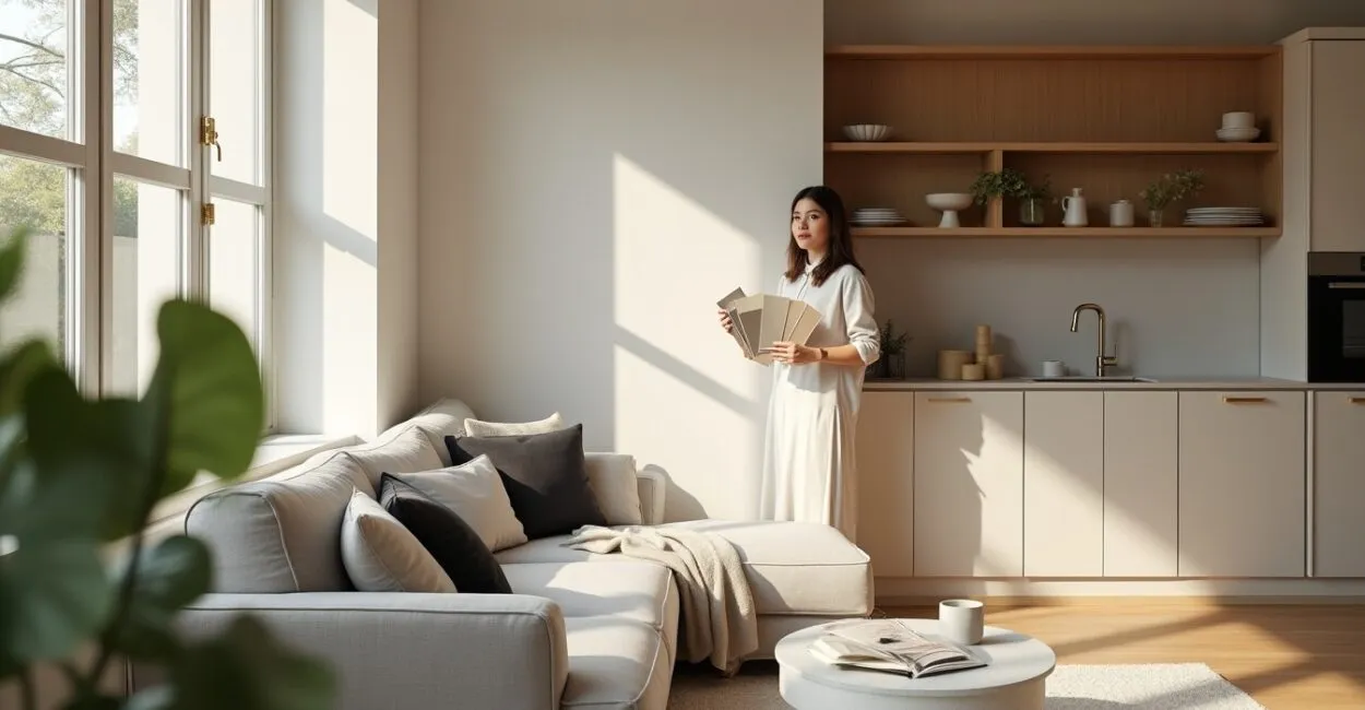
Neutral colors transform spaces, creating a sense of openness, calm, and versatility. Understanding how to use these shades is essential for maximizing space and light, especially in smaller rooms—and knowing where to start is the first practical step.
In many homes, the challenge is choosing between beige, gray, sand, or off-white without losing personality. We explore shades, contrast, textures, finishes, and how they interact with natural and artificial light to solve this challenge with practical techniques.

This article takes a narrative approach to show how neutral colors can make spaces look bigger, with examples for living rooms, bedrooms, and kitchens, plus tips on furniture and material combinations that add depth without overwhelming the room.
Neutral Color Palettes and Their Variations
Choosing Base Shades
When starting out with neutral colors, choose a base shade to serve as the main visual backdrop. Shades like beige, light gray, and off-white work like canvases that reflect natural and artificial light, making a space feel larger. Your choice depends on the light’s color temperature: warm bulbs call for neutrals with warm undertones, while cool light pairs better with bluish grays.
Paint large samples on different walls to see how they look in sunlight and under evening lighting. Testing them at different times of day helps prevent surprises in the finished result.
Pair the base shade with a complementary palette of deeper neutrals and soft accents to create visual layers without competing with furniture or decorative artwork.
Subtle Contrast Between Neutrals
Contrast in a neutral palette is subtle but powerful. Use variations like cream against sand or medium gray against off-white to define architectural features and guide the eye. This subtle contrast adds depth and direction without sacrificing a sense of openness.
Practical ideas: paint a recessed wall a slightly darker shade to create the illusion of depth, or use contrasting neutral trim and doors to define architectural features. Coordinating textures and finishes enhances the effect.
Remember to balance contrast with lighting. A darker color in a poorly lit area can make the space feel smaller, so adjust your fixtures or choose reflective finishes to compensate.
Harmony Between Undertones
Undertones—warm, cool, or neutral—determine whether a color feels cozy or airy. Warm undertones, such as yellow and pink, add a welcoming feel; cool undertones, such as blue and green, create a fresher look. Identifying the undertones in your flooring, furniture, and fabrics helps create a harmonious palette.
One technique is to hold paint samples next to the room’s dominant materials to check whether they work together. Avoid mixing strongly contrasting undertones without a transition: a blue-gray can clash with a yellowish beige if there are no connecting elements.
Using neutrals with compatible undertones creates a seamless visual flow, which is essential in small spaces that need to feel larger and connected from room to room.
Lighting and Neutral Colors in Practice
Assessing Natural Light
Before painting, observe how natural light moves through the space throughout the day. Neutral colors respond differently to north-, south-, east-, and west-facing light: north-facing light tends to cool colors, while south-facing light warms them. This assessment is key to choosing a shade that will make the room look bigger.
Place samples in the areas you use most and look at them in the morning, afternoon, and evening. Pay attention to reflections and shadows, which can change how you perceive the color and the room’s depth.
Understanding the direction of the light can also help you position mirrors, curtains, and furniture to maximize reflection and create a greater sense of space.
Complementary Artificial Lighting
- Choose the right color temperature (2700K-3000K for a cozy feel; 3500K-4000K for functional spaces).
- Layer your lighting: ambient, task, and accent.
- Choose fixtures with diffusers for even lighting.
- Add dimmers to control brightness and how colors appear.
Artificial light should complement natural light without overpowering the subtlety of neutral colors. Recessed lights and wall sconces create layers of light that bring out texture and depth without competing with the palette.
Use directional lighting in walkways and on vertical surfaces to make walls and ceilings feel larger, reinforcing a sense of space.
Reflective Surfaces and Finishes That Make Rooms Look Bigger
Low-sheen finishes, such as satin or matte, add sophistication while still helping a room feel larger. Highly glossy surfaces can create distracting patches of light, while matte finishes soften transitions. Paint with a slight sheen can make walls and ceilings feel more continuous.
Strategically placed mirrors and light-colored surfaces that reflect light can make rooms feel bigger. Glass, brushed metal, and furniture with raised legs keep the floor visually open, adding to the sense of space.
Combining reflective materials with matte textures balances brightness and comfort, creating rich visual interest without overwhelming the room.
| Type of Light | Effect on Colors |
|---|---|
| North-facing natural light | Cools colors and brings out blue undertones |
| South-facing natural light | Warms colors and brings out yellow undertones |
Textures, Materials, and Depth

Combining Textures Without Overwhelming the Room
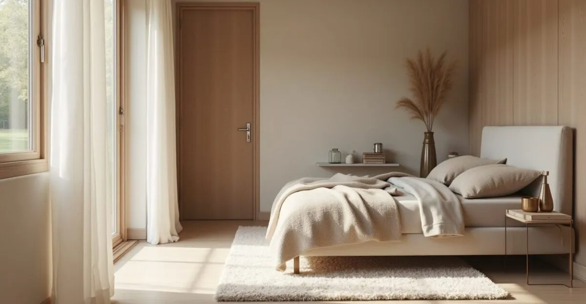
Textures create layers that reduce the need for lots of color. In neutral palettes, natural fabrics, plush rugs, and light wood add warmth, while light-colored porcelain tile and marble bring elegance. The goal is to vary textures to guide the eye and suggest depth without oversaturating the space.
In small spaces, focus tactile surfaces in key areas: a textured wall, an upholstered headboard, or pillows with subtle patterns. These elements add interest without making the space feel smaller.
Balance textures with coordinated neutral colors to maintain visual consistency and keep the room from feeling fragmented.
Materials That Enhance a Sense of Space
Light wood, glass, and matte-finish metals enhance the sense of continuity. Uniform light-colored flooring without visual breaks makes a room feel larger; slim baseboards and doors in a shade similar to the walls help eliminate visual interruptions.
Choose furniture with visible legs to open up the floor beneath it and make the usable area feel larger. Light-colored countertops and tabletops draw the eye upward, enhancing the sense of space.
When combining materials, keep a common thread—such as a recurring undertone or texture—to create a cohesive visual story.
Finishes and Tactile Appeal
Finishes affect how we perceive a color, including how it feels to the touch. Satin paint can hide imperfections and reflect light moderately; matte finishes convey sophistication and calm. In furniture, lightly textured fabrics add interest without competing with the neutral palette.
Choose finishes based on how the space is used: high-traffic areas need washable surfaces, while spaces for relaxing benefit from soft textures. Subtle tactile contrasts add visual depth without disrupting color harmony.
Carefully chosen finishes preserve a sense of space and strengthen the room’s overall aesthetic.
Practical Ideas for Living Rooms, Bedrooms, and Kitchens
Living Room: Creating a Spacious, Welcoming Feel
- Paint the main wall a soft off-white
- Choose a light beige sofa with textured pillows
- Use a low-pile neutral rug to maintain visual continuity
- Add a central light fixture with a dimmer
- Hang a large mirror in line with the window
In the living room, arrange furniture to keep pathways clear and choose pieces that suit the scale of the space. A light-colored sofa against the main wall creates visual flow, while a single subtly contrasting wall adds depth without closing in the room.
Layer your lighting and use vertical elements like lightweight curtains to draw the eye up and make windows seem taller. The result is a space that feels larger and more inviting.
Bedroom: Calm and a Sense of Space
In the bedroom, neutral colors promote rest and a sense of space. Choose warmer shades for a cozier feel or cooler ones for a fresher look. An upholstered headboard in a shade slightly darker than the walls defines the bed without making the room feel smaller.
Read also: Rural Insurance: Coverage and How to Choose a Policy
Soft-textured bedding and sheer curtains filter light while keeping the room feeling open. Built-in furniture with doors in the same color as the walls prevents visual interruptions.
Balancing function and style creates a retreat that feels both larger and more serene.
Leia também: Bromeliads and Their Special Care
Kitchen: Brightness and a Sense of Order
| Material | Recommendation |
|---|---|
| Countertop | Light-colored, durable surface |
| Cabinets | Neutral-colored fronts with discreet hardware |
In small kitchens, choose cabinets in a continuous neutral shade from floor to ceiling to eliminate visual breaks. Light-colored backsplash tile reflects light and makes the kitchen feel bigger. Open shelves in light wood add a sense of lightness without visual clutter.
Organization is essential: keeping fewer items in view makes the space feel cleaner and larger. Choose built-in appliances and discreet hardware to create a uniform look across cabinet fronts.
Furniture, Scale, and Layout for Neutral Spaces
Scale and Proportion
Choosing furniture at the right scale is crucial in neutral palettes, where color doesn’t distract from the size and shape of each piece. Oversized furniture can overwhelm a room; pieces that are too small can look out of place. Choose furniture with visible legs and frames to open up the floor and create a lighter look.
Well-proportioned, multifunctional tables and compact sofas provide comfort without sacrificing a sense of space. Measure and map out the furniture on the floor before buying to plan traffic flow and clearances.
Harmonious proportions between furniture and architecture let neutral colors do their job of making a room feel more spacious and calm.
Choosing Furniture and Finishes
Choose furniture finished in light wood, linen, or neutral-colored leather. Recessed hardware, smooth surfaces, and clean lines reinforce visual continuity. Modular furniture can be adjusted to suit your needs while keeping the palette consistent.
Avoid layering too many patterns; choose varied textures that complement the colors instead. A coffee table made of translucent material or with a light base has less visual impact.
Prioritize multifunctional pieces that keep the space organized, one of the most important factors in making a room look bigger.
Arranging Furniture to Make Rooms Look Bigger
Diagonal arrangements can create a sense of depth, as can positioning furniture along the length of a room. Avoid blocking windows and walkways; vary furniture heights to guide the eye and create layers. Negative space is your friend: thoughtfully placed open areas let a room breathe.
Use rugs to define zones without breaking up the continuous flooring. Placing mirrors across from windows doubles the light and extends the view.
Planning the layout before you buy ensures that neutral colors and furniture work together to make the space look bigger.
Combining Materials and Colors to Add Depth
Neutral Colors with Natural Elements
- Light wood for warmth and continuity
- Light-colored stone and marble for elegance
- Natural fabrics for texture and comfort
Combining natural materials with neutral colors creates a sensory experience that enhances the sense of space. Wood adds visual warmth; light-colored stone reflects light; natural fabrics soften transitions. Together, these materials add depth without overwhelming the palette and help create a welcoming, airy room.
Use these materials strategically—in flooring, countertops, or small built-ins—to create layers that enrich the neutral palette without competing with it.
Monochromatic Palettes and Accents
A monochromatic neutral palette makes a room feel larger through visual continuity. Add subtle accents—a pillow in a slightly different shade or artwork with a light-colored frame—to create a focal point without disrupting the sense of space. The key is to keep saturation and contrast in check.
Small touches of color can guide the eye, but keep neutrals dominant to avoid fragmenting the space. Repeating an element in a controlled way adds cohesion and interest.
A thoughtfully planned monochromatic palette creates sophisticated, spacious rooms where every piece serves an aesthetic and spatial purpose.
Combining Metals and Surfaces
Matte metals, such as satin brass and matte black, complement neutral colors without drawing too much attention. Use metals for details like hardware, lighting, and furniture bases. Avoid too many glossy finishes, which can create distracting reflections in soft palettes.
Metal accents create focal points and visual hierarchy. Choose one or two metal finishes and repeat them to maintain consistency.
Matte finishes on large surfaces and metal accents in the details strike a balance between spaciousness and personality.
Common Mistakes and How to Avoid Them with Neutral Colors
The Risks of a Poorly Executed Monochromatic Palette
A poorly executed monochromatic palette can make a room feel cold and impersonal. To avoid this, balance it with textures, variations in tone, and natural materials. Subtle contrast between walls and other elements creates visual layers that preserve unity without feeling monotonous.
A lack of focal points can also make a room feel flat. Artwork, a striking light fixture, or a statement piece of furniture can solve this without breaking up the neutral palette.
Use samples and mood boards to check how shades, undertones, and textures work together before committing to the final design.
Avoiding Dull or Dark Rooms
Painting a small room entirely in a very dark shade makes it feel smaller. If you choose deeper neutrals, compensate with strategic lighting, reflective surfaces, and a layout that maximizes the flow of light. Consider the shade’s depth in relation to the room’s sun exposure.
Rooms can also feel dull when they have too much furniture or bulky pieces. Prioritize a light visual feel and vary heights to break up large blocks.
Keeping key areas light ensures that neutral colors make the space feel larger, not more cramped.
Easy Fixes for Overcrowded Rooms
If a room feels cluttered, simplify: put away visible items, use consistent wood tones, and add one element of subtle contrast. Replacing heavy curtains with sheer ones and removing very dark rugs are quick ways to open up the space.
Another fix is to repaint a wall in a lighter shade or replace a piece of furniture with a lighter-looking version that has visible legs. Small changes can have a big visual impact.
These quick changes can restore a sense of space without major renovations.
Conclusion
Neutral colors are powerful tools for making spaces look bigger when used intentionally. Choosing shades with compatible undertones, adjusting the lighting, combining textures, and selecting furniture that’s the right scale can add depth without overwhelming the room. With these techniques, any small room can become a more spacious, functional, and welcoming place.
Try out samples, prioritize visual continuity, and adjust the lighting to see immediate results. Transform your home with neutral colors and share your process—the journey of designing with neutrals can reveal new possibilities for comfort and style.
Frequently Asked Questions
What Are the Best Neutral Colors for Small Spaces?
The best neutral colors for small spaces include off-white, soft beige, light gray, and sand shades with undertones that work with the lighting. These colors reflect light and create visual continuity, making a room feel larger. Test samples at different times of day to confirm your choice, and pair them with textures to keep the space from feeling cold.
How Does Lighting Affect the Choice of Neutral Colors?
Lighting changes how neutrals look: north-facing natural light cools colors, while south-facing light warms them. Artificial light should complement the room with appropriate color temperatures (2700–4000K) and layered lighting. Adjusting brightness and direction helps prevent dark areas and enhances the sense of space created by your chosen neutral colors.
Can I Use Neutral Colors in a Small Kitchen Without It Looking Boring?
Yes. Keep cabinets and walls neutral, and add texture, matte metals, light wood, and small accents to prevent monotony. Light countertops and a reflective backsplash make the kitchen look bigger. Organization and continuity of materials are essential for a cohesive, spacious result.
What Role Do Textures Play in Neutral Palettes?
Textures create layers that reduce the need for vibrant colors: fabrics, rugs, wood, and stone add tactile and visual depth. Combining soft and more structured textures adds interest without taking away from the subtlety of neutral colors, making the room feel welcoming and spacious.
How Do I Choose Furniture to Maximize the Sense of Space?
Choose furniture that’s in proportion to the room, with visible legs and finishes that work with the wall colors. Multifunctional and modular pieces help keep pathways clear; avoid overly bulky furniture. Well-placed rugs and arrangements that keep the floor open make neutral spaces feel larger.
Sources and references: Architectural Digest, Brazilian Institute of Engineering Appraisals and Expert Reports.
Artigos Relacionados
 Agricultural Machinery: How to Choose and Finance Equipment
 Why Pastel Colors Are Taking Over Zen Decor Again
 Family Pressure: How to Choose Your Major on Your Own
 Physical Therapist: How to Choose a Profitable Specialty
 Top University Rankings and How to Choose Wisely in 2025
 Professional Mentoring: How to Choose the Right Mentor Today