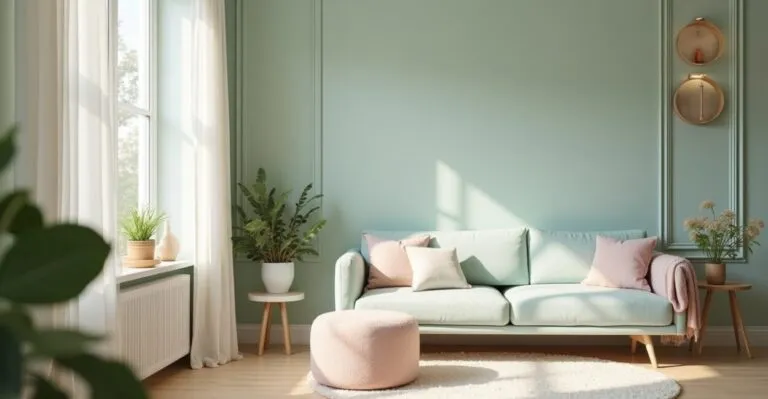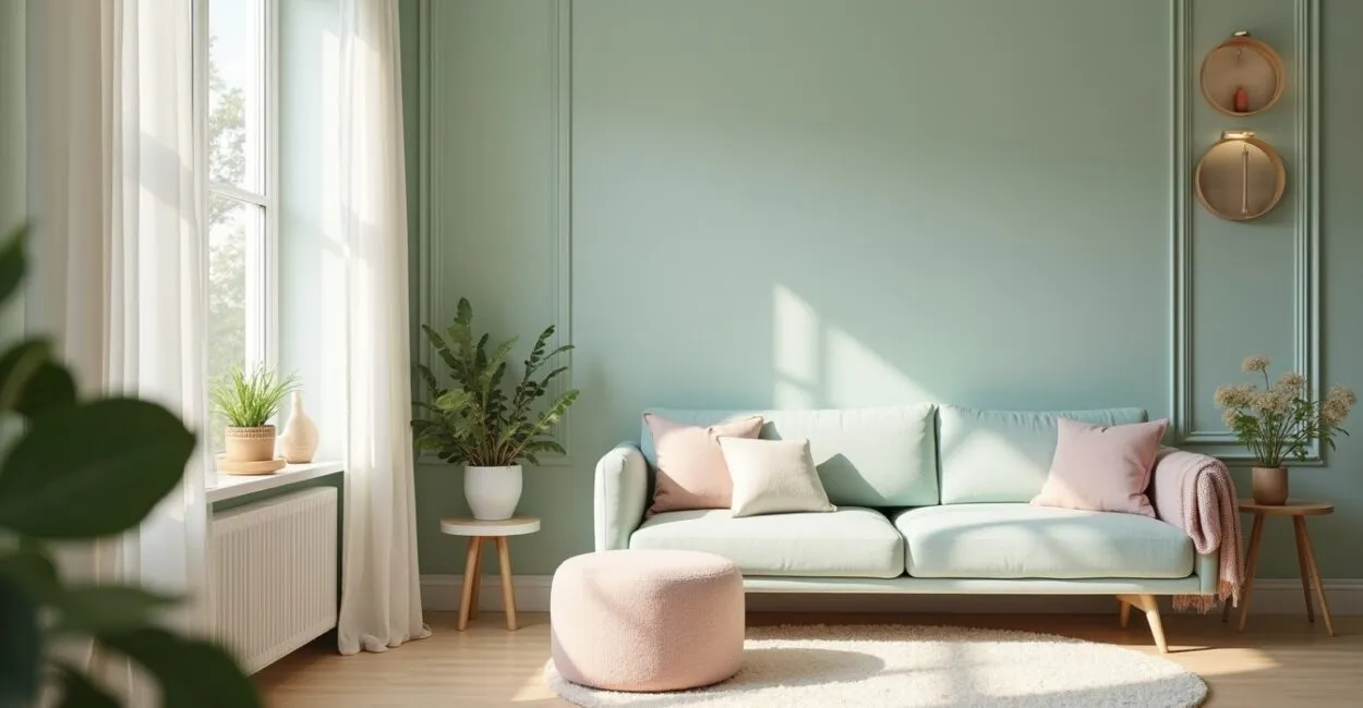
Pastel colors describe a palette of soft, muted hues that convey calm, balance, and coziness. Understanding what they are, why they matter, and how to use pastel colors is essential for anyone seeking zen decor and a greater sense of well-being at home.
Today, these hues are making a comeback in response to our fast-paced lives: they soften interiors, make small spaces feel larger, and bring harmony to open-plan kitchens and home offices. In this article, you’ll find historical context, looks at recent collections from major brands, and practical ideas for using pastel colors in different rooms. I’ll guide you through a journey—from discovery to the clash of trends and, finally, practical solutions—sharing palettes, combinations, examples, and technical references to help you get started right away.

The Revival of Pastel Colors in Home Decor
The Origins and Meaning of Pastel Colors
Pastel colors have historically emerged as softer variations, made with diluted pigments that evoke lightness and serenity. Today, this palette represents well-being, balance, and a warm minimalist aesthetic. The renewed interest in pastels reflects a desire for interiors that feel less visually harsh and more comforting.
When using pastel colors, think pale lavender, mint green, and dusty pink: these hues tone down a room’s intensity and create a sense of spaciousness. They work as a foundation for natural textures—light wood, linen, and ceramics—enhancing the zen effect.
Finally, choosing pastel colors is also a cultural choice: they evoke fond memories and soften contrasts, making them well suited to rooms designed for rest and productivity. This gentle palette makes it easier to transition between connected spaces, such as the living room and kitchen.
Pastel Colors and Zen Aesthetics
Zen aesthetics prioritize simplicity, order, and calm—qualities that pastel colors enhance. Hues like rosy beige, sky blue, and pale peach work as a neutral backdrop for objects and plants, creating focus without visual competition. In interior design, this creates spaces that seem to breathe.
Paired with diffused lighting, natural materials, and clean lines, pastel colors help create meditative spaces. They soften reflective surfaces and reduce eye strain, which is essential in relaxation areas and multipurpose rooms. The palette also balances textures, from velvet to rattan.
Pastel colors also make it easier to blend aesthetics with function: neutral-toned furniture and colorful pastel accessories offer decorating flexibility, making seasonal updates easy without renovations or major expenses.
The Psychological Impact of Pastel Colors
Research in environmental psychology documents the influence of color on mood: pastel hues tend to lower anxiety and support gentle concentration. In shared spaces, they encourage empathy and a sense of collective well-being. At home, they can help regulate emotions in everyday life.
Choosing pastel colors for bedrooms and living rooms reduces stressful stimuli and encourages rest. In a home office, hues like aqua and light blue can support focus without creating tension, balancing productivity and comfort. The palette acts as a sensory buffer.
Used strategically, pastel colors also affect how bright a room appears: they seem to reflect light more evenly, making spaces feel larger and softening shadows—an especially valuable benefit in compact apartments.
Pastel Color Palettes and Variations
Choosing Variations for a Pastel Palette
When choosing variations of pastel colors, consider temperature, intensity, and saturation. A palette can combine a cool hue, a warm hue, and a neutral for visual balance. For example, baby blue, soft peach, and satin beige work well together to create a welcoming space.
- Mint green with light wood
- Soft lavender with neutral fabrics
- Dusty pink with matte metals
- Sky blue paired with warm white
It’s also helpful to test samples at different times of day, since natural light changes how a hue looks. Pair pastel colors with pops of saturated color in decorative objects to add depth without losing the palette’s softness.
Finally, use texture—rugs, curtains, ceramics—to enrich the pastel palette and keep the result sophisticated rather than bland. The variations can be subtle, but together they convey a thoughtful aesthetic.
Harmonious Combinations with Pastel Colors
Harmonious combinations of pastel colors use soft contrasts: pairing a lighter hue with a slightly darker one creates pleasing visual layers. Analogous palettes (colors that sit near each other on the color wheel) maintain cohesion, while desaturated complementary palettes add interest without feeling harsh.
When planning a room, think of walls, upholstery, and accessories as different levels in a color hierarchy. A sofa in a more saturated pastel can serve as a focal point, while pillows and artwork in similar hues add texture without competing. The result is a harmonious, flowing space.
Finish the composition with natural elements—plants, wood, stone—that complement the soft colors and add tactile warmth. That way, the pastel palette becomes more than an aesthetic choice; it becomes a sensory experience.
Color Trends and Palettes for 2025
2025 trends point to pastels with earthy undertones and soft grays, creating palettes that balance modernity with coziness. The growing preference for sustainable colors is also influencing pigments inspired by nature: light moss, dusty peach, and airy blue are having a moment.
International brands and color institutes are embracing palettes that emphasize well-being and versatility, allowing for easy transitions between homes and workspaces. These contemporary pastel colors make it easy to create settings that look good in photos and feel good in everyday life.
Use these palettes as a starting point, then adjust the undertones to suit your lighting and existing furniture. Small changes can turn a dated palette into a timeless look that feels in step with current trends.
| Palette | Main Color | Recommended Use |
|---|---|---|
| Serenity | Sky blue | Bedrooms and home offices |
| Cozy | Dusty pink | Small living rooms and headboards |
| Freshness | Mint green | Open-plan kitchens |
How Pastel Colors Soften Small Spaces

Make a Room Look Bigger with Soft Colors
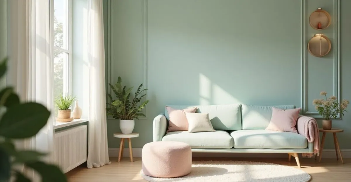
In small living rooms, pastel colors act as visual expanders: they reflect more light and soften hard edges, creating a sense of space. Light-colored walls paired with compact furniture in slightly contrasting pastels balance proportion and depth.
Another strategy is to carry a single pastel hue from the floor up to part of the ceiling to elongate surfaces; color continuity reduces visual interruptions. Vertical elements in similar colors can make a room feel taller, while wood details add warmth without making the space feel closed in.
Avoid too many strong contrasts in small spaces. Use textures and layers of pastel color to define zones—a seating area or reading nook, for example—without adding physical dividers that make the room feel cramped.
Lighting and Texture for Compact Spaces
Diffused lighting works beautifully with pastel colors: neutral-color-temperature bulbs bring out the palette’s softness. Translucent curtains in light colors filter daylight, while matte surfaces prevent unwanted glare. Textures like linen and upholstery add sensory interest.
Strategically placed mirrors make a room feel deeper without disrupting color harmony. Multifunctional furniture with a light pastel finish keeps the visual profile low, allowing for easy movement and a tidy appearance.
Combine task lighting with ambient lighting for relaxation, adjusting the brightness so pastel colors can continue to calm the room and make it feel larger.
Ideal Furniture and Decor in Pastel Colors
Choose furniture with simple lines and pastel or light neutral finishes. Dusty pink or blue-gray armchairs and sofas can stand out without overwhelming the room. Compact tables and open shelving preserve a light, airy look.
Use accessories—pillows, vases, artwork—to introduce variations in hue. Subtle contrast between fabric and light wood creates an organic balance and makes a room feel more welcoming. Avoid overly bold patterns that disrupt the sense of serenity.
For a cohesive look, repeat one pastel color in three different elements of the room (for example, a curtain, rug, and pillow). This repetition creates rhythm and cohesion, both essential in smaller spaces.
Using Pastel Colors in Open-Plan Kitchens
Functional Palettes for Open Kitchens
Open-plan kitchens need palettes that bring different areas together. Pastel colors—such as aqua, lavender gray, and pale peach—work well on lower cabinets or backsplashes, connecting with the living room without competing with it. The goal is to create harmony between circulation paths and gathering areas.
Durable materials, such as matte pastel lacquer or softly colored glazed tile, make cleaning and maintenance easier. Light stone countertops balance the palette, while brushed metal adds understated sophistication. A pastel palette helps the kitchen blend visually with the rest of the apartment.
Prioritize easy-to-clean surfaces and choose colors that can handle the marks and wear of everyday use. Practicality doesn’t have to come at the expense of a soft aesthetic: pastel colors can be durable and elegant.
Ergonomics and Materials That Make Pastel Colors Shine
Ergonomics in an open-plan kitchen is all about proportion and flow. Cabinets with integrated pulls and smooth-opening drawers pair well with pastel colors to reduce visual clutter. Materials like high-pressure laminate or matte lacquer in light colors offer durability and a polished look.
Read also: Why Pastel Colors Are Taking Over Zen Decor Again
Choose subtly textured finishes to help hide stains; matte pastel tiles can disguise splashes and reflect light evenly. Under-cabinet lighting and pendants with diffusers provide safe task lighting without disrupting the zen palette.
Add a multifunctional island in a pastel shade slightly darker than the background to create contrast without disrupting the sense of unity between the kitchen and dining or living room.
Practical Ideas for Organizing a Pastel Kitchen
Organization is essential to preserving the calming effect of pastel colors: open shelves with decor in coordinated colors make a kitchen feel less cluttered. Use translucent containers and understated labels to keep things looking neat and easy to use every day.
Keep work surfaces in neutral tones and save pastels for cabinet fronts or panels. This makes cleaning easier and simplifies future touch-ups. Add small plants for a touch of natural green that pairs beautifully with the pastel palette.
Finally, choose a secondary accent palette—metals, wood, matte black—to add points of interest without losing the sense of calm. This creates a kitchen that is functional, organized, and visually light.
| Element | Material | Recommendation |
|---|---|---|
| Cabinets | Matte lacquer | Light pastel colors, integrated pulls |
| Backsplash | Glazed tile | Soft pastel with a matte finish |
| Countertop | Quartz | Light neutral for subtle contrast |
Home Office Productivity with Pastel Colors
Colors That Improve Focus and Reduce Stress
In home offices, pastel colors moderate visual stimulation and support sustained concentration. Pale blues can increase feelings of confidence and focus, while soft greens encourage mental relaxation. The right choice depends on the task: creative work calls for warmer pastels, while analytical work benefits from cool, calm hues.
Balance the palette with ergonomic furniture and light-colored work surfaces. Natural light and lamps with a neutral color temperature help maintain visual comfort. Minimal decor and organized shelves in coordinated colors reduce distractions.
Add textures for acoustic and tactile comfort—curtains, fabric-covered pastel acoustic panels, and rugs—to keep the space inviting without compromising its professional function.
Layout and Ergonomics with a Pastel Palette
A home office layout should balance flow and accessibility. Walls in a soft pastel shade reduce visual strain and make the space feel larger. Position your desk to take advantage of natural side light, and choose a chair in a coordinating fabric to bring function and style together.
Use modular shelving in colors close to the wall color to create continuity. Monitors with discreet bezels and adjustable stands keep the lines clean. Vertical organization in pastel colors helps sort items into categories without adding visual clutter.
Small accent pieces—lamps, pen holders, vases—should follow the palette to maintain visual focus and encourage a sense of order and structure in the workday.
Recent Products and Collections Featuring Pastel Colors
Major furniture and paint brands have released collections featuring pastel colors, matte finishes, and eco-friendly formulas. These launches include acoustic panels, modular shelving, and ergonomic chair lines with washable pastel fabrics, designed for home and hybrid workspaces.
Lighting companies are also offering pendants with diffusers in soft hues, designed to create lighting scenes that complement the palette. Paint manufacturers offer digital and physical samples to help customers choose colors based on the room’s lighting.
Consulting catalogs and collections can help you incorporate ready-made solutions into your design, saving time and ensuring color consistency—a practical benefit for anyone seeking a functional, attractive home office.
Recent Brands, Collections, and References
Major Brands Bringing Back Pastel Palettes
Well-known home decor companies are bringing back pastel palettes as part of collections focused on sustainability and well-being. Paint brands publish color pairing guides, while furniture makers release lines in matte lacquer and washable fabrics in soft hues.
These collections often draw on color trend research and collaborations with designers to create palettes suited to contemporary lifestyles. They give shoppers more options for achieving a professional look without hiring a designer for a full project.
To explore these collections, visit brand websites and online catalogs, which offer visualization tools and physical samples for testing in your own space.
Designer Collections and Recent Collaborations
Collaborations between designers and brands have produced iconic pieces: multifunctional pastel furniture, sculptural lighting, and textiles that pair soft colors with rich textures. These partnerships elevate pastel palettes into original design while keeping them practical for the home.
The collections focus on adaptable spaces, allowing arrangements that work in both compact apartments and homes with open layouts. New releases include coordinated colors designed for both photography and everyday use.
Consulting design magazines and platforms from major manufacturers can help you identify key pieces and emerging trends, making it easier to curate your home using professional references.
Where to Find Inspiration and Reliable References
Reliable sources include design websites, color institutes, and portfolios from established studios. Platforms like ArchDaily and design publications showcase projects where pastel colors are used with aesthetic and technical precision. Academic research on color can deepen your understanding of its psychological effects.
It’s also worth visiting concept stores and showrooms to experience textures and finishes in person. Physical samples are essential for checking how colors look with your existing lighting and furniture. Trade shows and exhibitions offer a chance to see designer collections and new material innovations.
Collect visual references and create digital or physical mood boards to test combinations before investing in paint or furniture—a practice that reduces mistakes and helps ensure a cohesive use of pastel colors.
A Practical Room-by-Room Guide
Small Living Room: Layout and Furniture
In small living rooms, choose a light pastel for the walls, a focal piece of furniture in a more saturated pastel, and neutral accessories. Use a rug and curtains in coordinating colors to bring the space together. Plants and ceramic objects add texture without competing with the palette.
Avoid too many bulky pieces; choose multifunctional furniture and open shelving to maintain a sense of flow. Repeating the same color in three different spots creates rhythm and a sense of spaciousness. Use diffused lighting with focused lights for reading.
For balance, add an element in light wood or matte metal to provide subtle contrast and keep the room from feeling monochromatic. This helps a small living room feel cozy and spacious.
Open-Plan Kitchen: Colors and Organization
In open-plan kitchens, use pastel colors on lower cabinet fronts and neutrals on upper cabinets to keep the space feeling light. A pastel tile backsplash with light grout is easy to clean and has a softer visual impact. Organize utensils in coordinated containers to balance style and practicality.
Plan lighting over countertops and the dining area, using pendants with soft-tone diffusers. Light countertops and discreet appliances let the palette stand out without competing for attention. Prioritize modular solutions to make the most of the space.
Add culinary herbs in pastel pots for both looks and function. Small changes, like brushed metal pulls, can elevate the design while preserving the desired softness of the color scheme.
Home Office: Lighting and Ergonomics
Choose an accent wall in a pastel shade that looks good on video calls and doesn’t create glare. A light wood ergonomic desk and a chair with pastel upholstery provide comfort and visual cohesion. Neutral-temperature lighting prevents color distortion and eye strain.
Coordinated organizers and shelves keep things tidy and reduce distractions. Use a pastel fabric acoustic panel to improve both sound and appearance. Carefully chosen plants and personal items add character without making the space feel cluttered.
Test your furniture arrangement with circulation and ergonomics in mind: monitor distance, foot support, and desk height. A pastel palette can help create a productive environment, but functionality should remain the priority.
Conclusion
Pastel colors have returned in response to the desire for greater well-being, offering palettes that soften interiors, make small spaces feel larger, and bring balance to open-plan kitchens and home offices. The palette has both emotional and practical benefits, creating spaces that invite rest and productivity.
Try samples, combine natural textures, and explore recent collections from brands that prioritize sustainability. Use pastel colors to transform your home, and share the results—your home can become a serene, modern retreat.
Frequently Asked Questions
What Exactly Are Pastel Colors, and Why Are They Considered Zen?
Pastel colors are desaturated hues with a high proportion of white that convey calm and visual softness. They’re considered zen because they reduce stimulation, promote a sense of space and well-being, and complement natural materials, helping create relaxing, organized interiors.
How Do I Choose the Right Pastel Palette for a Small Living Room?
Choose a light shade as the base for the walls, a slightly more saturated color for a focal piece of furniture, and neutral accessories. Prioritize color continuity, natural textures, and diffused light; test samples in the room’s actual lighting before painting or buying furniture.
Which Materials Work Best with Pastel Colors in an Open-Plan Kitchen?
Matte lacquer, matte glazed tile, light quartz, and light wood work especially well. Choose easy-to-clean surfaces and matte finishes to help hide marks; brushed metals and ceramics add sophistication without disrupting the soft look.
Do Pastel Colors Work in Professional Home Offices?
Yes. Pastel colors create spaces that support gentle concentration and reduce stress. Pair them with proper ergonomics, good lighting, and organization; choose hues based on the nature of your work—cool shades for analysis and warm ones for creative tasks.
Where Can I Find Reliable References and Collections in Pastel Colors?
Look for inspiration on architecture websites, in furniture and paint catalogs, and at showrooms. Sources like ArchDaily and color institutes offer projects and research; check physical samples to make sure the colors work in your actual space.