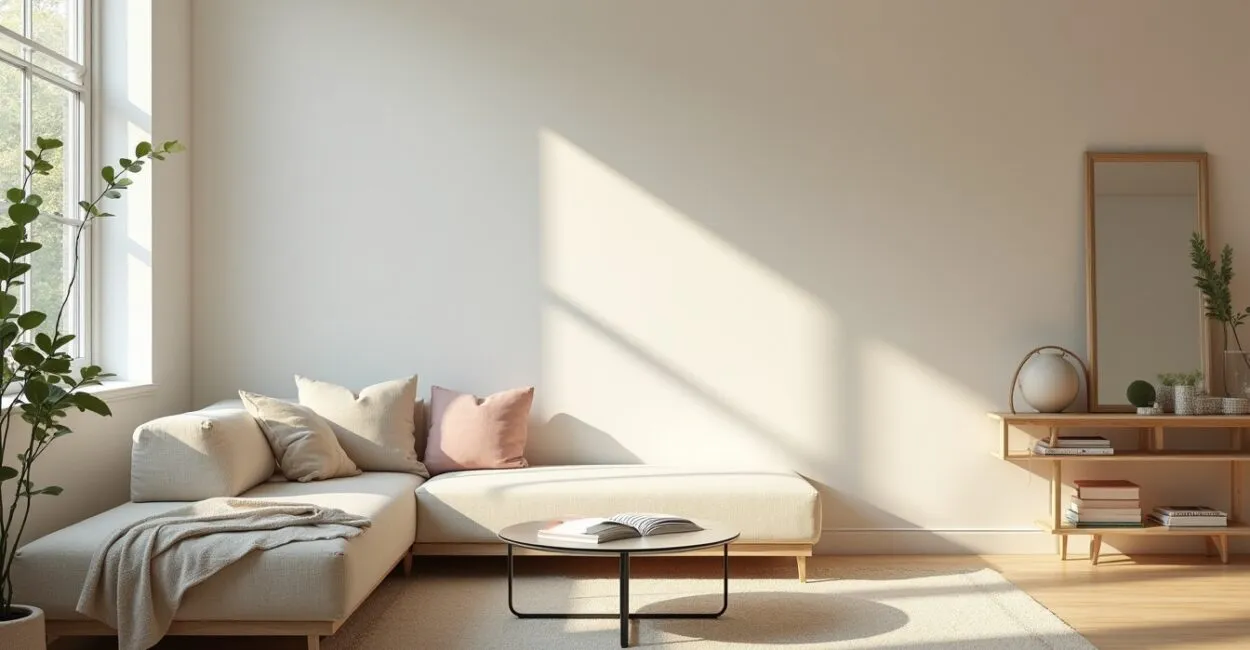
Choosing light colors can transform a room: they make it look larger, brighten it, and create an airy feel. Light colors are essential for anyone looking to make a space feel bigger, helping natural light, furniture, and finishes work together.
In many homes and offices, people wonder which light colors work best based on room size, lighting, and existing furniture. Understanding the differences between beige, off-white, light gray, and soft pastels is the first step toward making any room look larger.

In this article, I’ll take you through the world of light colors. We’ll explore their characteristics, palettes, proportions, paint recommendations, finishes, and foolproof combinations for a harmonious, spacious feel.
Light Colors and the Feeling of Spaciousness
Why Light Colors Make Spaces Look Larger
Light colors make a space feel larger by reflecting more light, creating visual depth, and reducing the shadows that can make a room feel “flat.” They work like a lens that expands proportions, especially in rooms with little natural light. Choosing colors that reflect light can make ceilings seem higher and walls feel farther apart.
The right choice depends on the direction of the light, the flooring, and the furniture: glossy surfaces reflect more light, while matte textures diffuse it softly. The interplay of light, color, and texture determines whether the result feels light and airy or cold and impersonal.
For designers and homeowners, understanding how light colors interact with architectural features is the foundation of making a space look larger—and the first step before choosing a palette and proportions.
The Psychological Impact of Soft Colors
Light colors tend to convey calm, cleanliness, and order, influencing the mood of the people in a room. Beige and off-white evoke comfort and warmth; light gray feels modern; and soft pastels add subtlety and character. These emotional responses can make a room seem larger by creating a sense of calm and visual continuity.
Color psychology also guides choices for pairing colors with furniture: light warm tones create a welcoming feel in gathering spaces, while cool neutrals help maintain focus and airiness in work areas. These choices affect behavior and how a space is perceived over time.
Choosing light colors is about more than aesthetics. It’s a way to shape a room’s mood and function while maximizing the feeling of spaciousness without sacrificing personality.
How to Assess Your Space Before Painting
Start with a quick assessment: note the natural light, which direction the windows face, the dominant furniture colors, and the room’s actual dimensions. Check the light at different times of day. Rooms with limited light call for warmer light colors to avoid a cold, gray feel. Very small spaces benefit from off-white or beige with neutral undertones.
Look at the textures of your flooring and curtains. Light wood pairs well with complementary colors, while dark floors can benefit from contrast with off-white or soft gray. Take photos at different times of day to see how the colors look in changing light.
With this information, you can choose the right family of light colors and plan the proportions of paint, furniture, and decorative elements to make the space look larger.
Light Color Palettes for Small Spaces
Practical Palettes for Compact Bedrooms
In small bedrooms, choose colors that add warmth and depth without diminishing the light. Off-white with yellow undertones, pale beige, and warm light gray all work well, creating a spacious yet cozy feel. Avoid very cool, grayish tones if the room gets little light, as they can make it feel flat.
- Warm off-white with light wood
- Pale beige paired with earth-toned textiles
- Warm light gray with leather accents
- Soft peach pastel for a feminine touch
Think carefully about the proportions of the walls, ceiling, and furniture. A main wall in a subtly contrasting light color, with the remaining walls in off-white, adds visual depth and leaves room for soft pops of color.
Ideal Palette and Proportions for Narrow Living Rooms
In a narrow living room, use a slightly darker light color on the side walls and off-white on the ceiling and back wall to create a sense of width. The subtle contrast between walls helps visually “push” the sides outward, while the light ceiling makes the room feel taller.
Pair the colors with streamlined furniture and neutral upholstery. Light-colored, textured rugs define areas without making the space feel closed in. Sheer curtains enhance the light and create continuity between the walls and windows.
Small pops of color in decorative objects draw the eye and prevent monotony, while keeping the spacious feel at the heart of the design.
Comparison Table: Recommended Colors for Small Spaces
| Shade | Benefit | Best for |
|---|---|---|
| Warm off-white | Reflects light, feels cozy | Bedrooms and low-light living rooms |
| Pale beige | Softens strong contrasts | Rooms with dark furniture |
| Warm light gray | Modern look, controls glare | Home offices and contemporary living rooms |
Beige, Off-White, and Neutral Variations

Beige: Shades and Foolproof Pairings
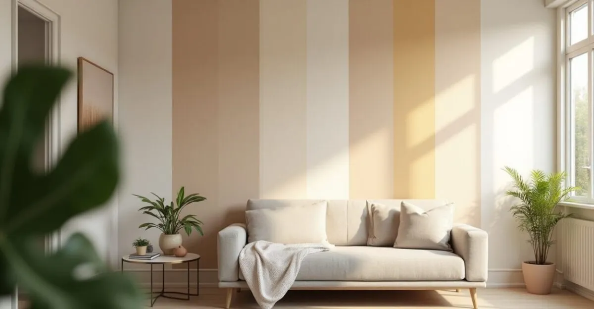
Beige comes in shades ranging from pale to medium, with yellow, pink, or gray undertones. In small spaces, choose less saturated beiges so they don’t absorb too much light. Pair them with light wood and gold-tone metals for warmth, or with soft grays for a contemporary look.
When using beige, test large samples on the wall and look at them in the morning and late afternoon. Changes in light reveal undertones that can affect the room’s overall feel, so always test before making your final choice.
Beige is versatile: it provides a neutral base for adding color through textiles and artwork without competing with the decor, enhancing a sense of visual continuity.
Off-White: When to Choose It and How to Balance It
Off-white is white softened with undertones of yellow, beige, or gray, which keeps it from feeling as stark as pure white. It works well on ceilings, walls, and trim, making a space feel larger without losing warmth. In rooms with plenty of light, cool off-white maintains a crisp look; in low-light spaces, choose warm off-white for a cozier feel.
Balance off-white with textures such as linen, wool, and wood to avoid a clinical look. Painting the ceiling the same off-white creates continuity and makes it feel taller.
Pair off-white with subtle color accents: pillows, artwork, and plants add life without compromising the spacious feel of the neutral base.
Classic Neutral Color Combinations
Light neutrals provide a versatile backdrop for foolproof combinations: natural wood, brushed metals, and natural fibers add layers that enrich a room. For a classic scheme, pair off-white walls with beige upholstered furniture and light gray rugs for balance and depth.
Another effective combination is off-white, very light gray, and a pastel accent (baby blue or mint green) in accessories. This palette keeps the space feeling open while adding subtle personality.
Designers rely on these combinations to make spaces look larger and create a timeless aesthetic, making future updates easy without major renovations.
Light Grays and Contemporary Palettes
Light Gray: Undertones and Practical Uses
Light gray ranges from warm undertones (with beige) to cool ones (with blue). In modern spaces, warm light gray keeps the room feeling cozy; cool gray works well in rooms with plenty of natural light. Consider your furniture: light wood pairs best with gray that has warm undertones.
Using light gray on the main walls with off-white on the ceiling creates depth. Avoid very neutral grays in dark spaces, as they can make the room feel austere.
Touches of wood and plants offset the coolness, keeping the look contemporary without sacrificing the spacious feel of light colors.
Pairing Gray with Wood and Metal
Light gray pairs especially well with light woods such as birch and oak, as well as matte-finish metals. Wood grain adds warmth and dimension; metal creates focal points without weighing down the look. In kitchens and living rooms, the mix feels modern and visually cohesive.
Read also: How to Organize Built-In Closets to Save Space
To keep the look balanced, use reflective surfaces in moderation, such as light countertops and matte metals. They help distribute light without creating too much glare. The finish you choose directly affects how spacious a room feels.
These combinations create sophisticated, spacious rooms where light colors consistently shape the visual experience.
Table: Finish and Visual Effect
| Finish | Visual effect | Best for |
|---|---|---|
| Matte | Softens shadows, subtle texture | Living room and bedroom walls |
| Semi-gloss | Reflects more light, easy to clean | Kitchens and bathrooms |
| Satin | Balances sheen and texture | Walls in shared living spaces |
Soft Pastels and Pops of Color
Pastels: When to Use Them to Make a Space Feel Larger
Soft pastels—baby blue, mint green, and dusty pink—can make a room feel larger when used in moderation. They add personality without sacrificing the light-reflecting quality of light colors. In spaces with plenty of natural light, pastels add depth, prevent monotony, and help define different areas without making the room feel smaller.
Use pastels on secondary walls, furniture, or accent panels. Avoid covering every surface in color; keep most of the room off-white or beige to preserve brightness. Small, controlled contrasts can make a space look larger and add visual interest.
Pastels work well in kids’ bedrooms, reading nooks, and spaces where you want a light color palette with a warm, inviting feel.
Color Proportions and Balance
Use the 60/30/10 rule for palettes with pastels: 60% base colors (off-white or beige), 30% light gray or wood, and 10% pastel accents. This proportion maintains harmony and preserves a spacious feel, drawing the eye without overwhelming the room.
In small spaces, increase the base color to 70% and reduce accents to 5–10% to avoid a closed-in feel. Adjust the proportions to suit the room’s function: living areas can handle more color accents than hallways or bathrooms.
Well-defined proportions make it easier to choose furniture and decor, ensuring that light colors continue to make the space feel larger.
Foolproof Pastel Pairings
Pair pastels with light neutrals and natural wood for an elegant, airy effect. Pastel plus off-white plus textured natural fibers, such as cotton or linen, creates depth without reducing the light. For subtle contrast, add small touches of gold or copper.
Avoid pairing pastels with highly saturated colors in small rooms; choose soft-colored accessories instead to maintain visual continuity. In larger spaces, pastels can play a bigger role, such as on accent panels or upholstered furniture.
These combinations let light colors take center stage while adding warmth and personality to the space.
Choosing Paint, Finishes, and Application
Paint Brand and Product Recommendations
Choose quality paints with good coverage and resistance to yellowing. Well-known brands offer interior-specific interior lines with stable pigments. Look for products with good opacity to reduce the number of coats needed and keep light colors even.
In damp areas, use washable acrylic paint with a mildew inhibitor; in living spaces, low-VOC paints help maintain healthy indoor air. Check the product specifications and test the color on large sample cards before buying paint.
Remember: paint is a tool, not a complete design solution—textures, lighting, and furniture round out the look of a room painted in light colors.
Ideal Finishes for Each Room
Choose a finish based on the room’s function: matte for bedroom walls (it softens imperfections), satin for living rooms (it balances feel and reflectivity), and semi-gloss for kitchens and bathrooms (for durability and easy cleaning). The finish directly affects how light reflects and, in turn, how spacious the room feels.
For ceilings, choose matte white or off-white to maximize reflectivity without too much shine. Test samples and check how they look at night under artificial light and during the day in sunlight to make a more informed choice.
Consistent finishes on walls and ceilings help create a continuous visual flow, which is essential for making a space feel larger.
Application and Surface Preparation Tips
Prepare surfaces with joint compound and fine sanding to prevent imperfections from casting shadows. Apply a neutral primer to ensure even absorption on new or previously painted surfaces. Use a lambswool roller for smooth finishes and a brush for corners; two coats are standard with quality paint.
When painting, use painter’s tape to keep edges clean, and protect baseboards and furniture. Work in sections and follow the recommended drying times to prevent streaks and subtle color variations.
Proper preparation and application help light colors do their job of brightening a room and making it feel larger, with no surprises in the final color.
Real-Life Transformations: Before-and-After Projects
Case Study: A Small Living Room Feels More Spacious
Imagine a narrow living room with dark furniture and little light. The transformation starts with off-white walls, light gray on the back wall, and a warm white ceiling. Replacing heavy curtains with sheer ones and scaling back on bulky furniture opens up the room right away.
Strategically placed mirrors and a light-colored rug bring the space together, while touches of wood warm up the look. This project shows how light colors can shift the focus and make the room more enjoyable to use.
The result is a room that feels open and airy. The spacious feel comes not just from the color, but from combining choices that emphasize continuity and reflectivity.
Project: A Compact Kitchen with a Light, Airy Feel
In a compact kitchen, painting the lower cabinets light gray and the upper cabinets off-white brightens the room vertically. Light countertops and a subtly textured backsplash reflect light without competing for attention. Under-cabinet lighting improves functionality without making the space feel darker.
High-performance, easy-to-clean materials and semi-gloss finishes make it easier to maintain a clean kitchen while controlling shine. The interplay of light colors creates a greater sense of depth between cabinet fronts and walls.
This transformation shows how a thoughtful color scheme, paired with lighting and texture, can make a kitchen feel more spacious and inviting.
Practical Checklist for Making Changes
Before painting, assess the light, test samples, choose a finish, and calculate how much paint you’ll need. Plan the number of coats and drying times, protect furniture, and finalize your palette. Choose streamlined furniture and sheer fabrics to maximize the effect of light colors.
During the project, take photos and adjust the colors if needed. Afterward, assess the proportions and add subtle accents for visual balance.
This checklist is a practical guide to using light colors with confidence, minimizing rework, and achieving the spacious feel you want.
Conclusion
Light colors are powerful tools for making a space feel larger. Combining off-white, beige, light gray, and soft pastels can create depth, calm, and more brightness. The right choice depends on the light, furniture, and function of the room, as well as the proportions of the walls, ceiling, and accents.
Test samples, adjust finishes, and keep textures consistent to get the most out of light colors. Make gradual changes and see how a more spacious feel can transform your everyday experience of the room.
Frequently Asked Questions
Which Light Colors Work Best in Small Bedrooms?
In small bedrooms, warm off-white, pale beige, and light gray with warm undertones work best. They reflect light, avoid a cold feel, and create a cozy atmosphere. Pair them with light wood and soft fabrics to maintain a sense of space and comfort.
How Do I Choose Between Off-White and Pure White?
Choose off-white if you want warmth and want to avoid a clinical look; pure white can make a room feel larger, but may seem cold. Consider the natural light: rooms with little light benefit more from warm off-white, while very bright spaces can use pure white without losing a cozy feel.
Which Finish Should I Use to Make Walls Look Larger?
Choose a matte finish to soften imperfections and diffuse light evenly. Satin works well in living areas, while semi-gloss is easy to clean in kitchens and bathrooms. The key is to balance reflectivity and texture so the room feels larger without excessive shine.
Can Pastels Make a Space Feel Smaller?
Pastels won’t make a space feel smaller when used in the right proportions. In fact, they can add depth when used sparingly over a neutral base. Keep most surfaces in light, neutral colors and use pastels as accents to avoid making the walls feel closer.
What Color Proportions Should I Use to Make a Space Feel Larger?
Use the 60/30/10 rule: 60% base color (off-white or beige), 30% secondary color (light gray or wood), and 10% accent color (pastel). In very small spaces, increase the base color to 70% and reduce accents to 5–10% to preserve a spacious feel.
Useful links: Architectural Digest, NCS Colour.
Artigos Relacionados
 How to Choose Neutral Colors to Make Spaces Look Bigger
 Writing That Captivates: What Techniques Make Writing More Engaging?
 Why Pastel Colors Are Taking Over Zen Decor Again
 College Routine: 5 Mistakes That Hurt Your Grades
 Future Careers: 7 Degrees That Don’t Exist Yet
 Profitable Agroforestry: 3 Models That Became Businesses