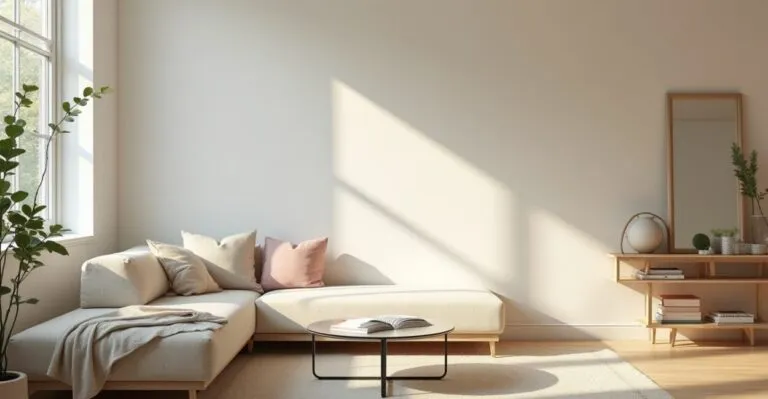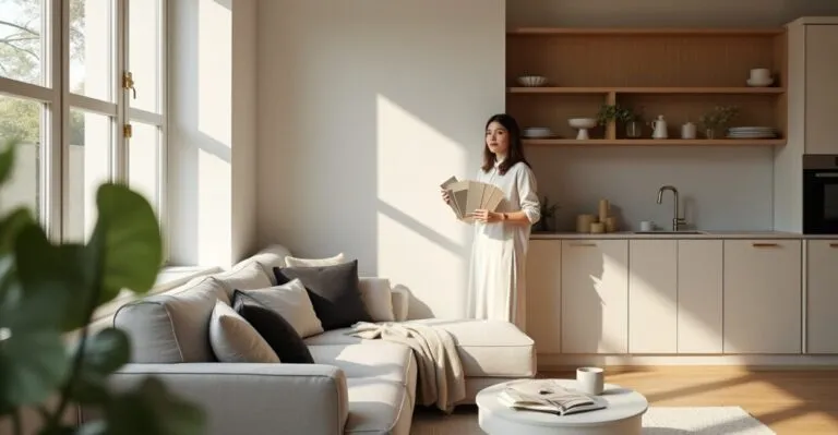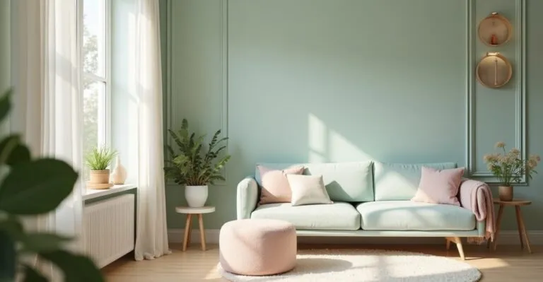
This refers to a carefully selected range of whites, beiges, grays, earth tones, and muted variations that work as a color foundation for residential and commercial projects. Technically, I define it as a visual anchor system that regulates contrast, texture, and the perception of space.
A neutral color palette is important because it can make small rooms feel larger, reduce visual clutter, and maximize natural light. However, it can also be challenging to create contrast and personality if it’s not applied well. I share practical experience and technical criteria for getting the most out of a neutral palette.

Key Takeaways
- Balance color temperature and reflectance to make small spaces feel larger.
- Use materials and textures to add depth without overwhelming the visual field.
- Choose finishes based on lighting, performance, and maintenance costs.
Why Choose a Neutral Color Palette
When choosing a neutral color palette, I prioritize visual efficiency and flexibility; here, I explain how neutral colors affect the way we perceive architecture, manage light, and integrate furniture. I also point out ways to add character without sacrificing visual cohesion.
The Impact of Color Temperature
Color temperature defines how warm or cool a space feels and shapes visual comfort. By adjusting whites to be warmer or cooler, I can influence a room’s atmosphere, compensate for limited natural light, and reduce the need for additional lighting. To fine-tune color temperature, I assess the predominant natural light and use large samples to confirm my choices. This prevents differences between a small color sample and how the color looks across an entire surface, minimizing rework and operating costs.
The practical benefits include lower energy use and a greater sense of space. Well-balanced neutral rooms reduce eye strain and make it easier to update the decor without repainting often.
Reflectance and the Perception of Space
Surface reflectance directly affects how spacious a room feels. I choose finishes with appropriate light reflectance values (LRVs) to maximize light reflection without creating excessive glare, so light surfaces open up a room without losing texture or definition. When selecting an LRV, I consider luminance data alongside materials and surface treatments, prioritizing options that increase natural light and reduce the need for bright artificial lighting during the day.
As a result, small rooms gain depth without driving up costs, while maintaining visual comfort and avoiding contrasts that could break up the visual field.
Pairing Neutral Colors with Furniture and Materials
Choosing fabrics, wood, and metals that work with a neutral color palette requires careful attention to undertones and color variations. I prefer combinations that create visual hierarchy and tactile contrast, avoiding a flat, monochromatic look that can diminish the sensory experience of a space. I focus on durability and ease of care, choosing surfaces that stand up to everyday use without changing color significantly over time. This preserves the overall look and reduces the need for future updates.
The result is a cohesive mix of materials that makes small rooms feel larger through visual and textural continuity, while making it easy to adapt and refresh the decor.
Color Composition and Harmony
When putting together a neutral color palette, I apply principles of harmony that account for intensity, saturation, and undertones to create a dynamic balance. Here, I outline ways to combine colors that add controlled variation without sacrificing a sense of unity and spaciousness in compact rooms.
Understanding Undertones
Undertones affect how a neutral color responds to light and nearby materials. I assess warm and cool undertones to make sure the elements work together, avoiding color clashes that can disrupt the perception of continuity. My method includes comparing samples at different times of day and under different light bulbs to anticipate changes. This helps prevent surprises during installation and keeps the look cohesive in everyday use.
When carefully managed, undertones create a sense of depth that makes a room feel larger, helping small spaces look sophisticated and function well.
Functional and Aesthetic Contrast
Contrast shouldn’t be eliminated; it should be carefully balanced. I add contrast through texture, sheen, and subtle patterns to guide the eye and clarify the layout without compromising the overall neutral look. Moderate contrast helps distinguish important areas, such as work zones and walkways, while maintaining clarity and safety—essential in both residential and commercial projects.
This is especially noticeable in small rooms, where controlled contrast emphasizes volume and keeps flat surfaces from looking dull or making the space feel smaller.
Neutral Colors and Sensory Appeal
Neutral colors don’t have to feel emotionless. I use tonal variations and tactile materials to create a sense of warmth, calm, or sophistication, depending on the goals of the project, connecting sensory appeal with the room’s function. I combine natural and synthetic elements to shape the mood, using light wood, stone, and fabrics to add depth without competing with the neutral color scheme.
This balance of practicality and sensory appeal makes small rooms feel larger and more welcoming, with a consistent, inviting look.

Materials, Textures, and Finishes

Choosing the right materials and textures is essential to making a neutral color palette work. I prioritize surfaces that add visual layers without overwhelming the space, combining matte and glossy finishes, as well as varied textures. I also outline performance and maintenance considerations for each choice.
Wood and Natural Surfaces
Light wood and subtle grain patterns add warmth and tonal variation to a neutral color palette. I assess durability, source, and finish to ensure the wood works with the lighting and everyday use, helping it look good for years. Surface treatments and varnishes affect LRV and color perception, so I run practical tests to find the right balance between initial appearance and long-term performance, avoiding discoloration or changes in undertone.
Wood balances the coolness of ceramic and metal, adding texture and scale that help small rooms feel larger through well-planned visual layers.
Fabrics and Upholstery
Blended fabrics offer the durability and tonal variation needed to enrich a neutral color palette. I choose materials that can withstand professional cleaning without fading, preserving the original color scheme. Weave and sheen affect both light reflection and comfort, so I prefer blends that hold up to light and abrasion, keeping furniture looking neutral without excessive shine that could flatten the space.
The result is a cohesive visual field that makes room for functional elements while preserving a sense of spaciousness and tactile comfort in compact spaces.
Technical Finishes and Maintenance
Ceramic and composite finishes affect overall reflectance. I prioritize materials with stable color and easy-to-clean surfaces, reducing maintenance costs without compromising the intended sense of space. Technical considerations include abrasion resistance, UV-related color changes, and compatibility with cleaning products. These factors help keep a neutral color palette consistent for years while preserving its appearance and performance.
Well-informed finish choices make small rooms look better cared for and more durable, maximizing the return on a renovation or construction investment.
Read also: Strategic Interior Painting to Make a Room Feel More Spacious
Lighting for a Neutral Color Palette
Lighting is essential to making small rooms feel larger with a neutral color palette. I treat lighting design as an extension of the color scheme, fine-tuning temperature, distribution, and intensity to bring out undertones, textures, and volume efficiently and economically.
Natural Light and Sun Exposure
Sun exposure affects how a neutral color palette looks. I measure solar gain and light diffusion to select tones and materials that respond well throughout the day, avoiding surfaces whose undertones shift in direct sunlight. By balancing light transmission and sun protection, we can reduce glare and preserve the original color of finishes—essential for keeping the palette looking neutral throughout the day.
This approach creates a greater sense of space and thermal comfort, directly improving the livability and energy efficiency of small rooms.
Artificial Light Color Temperature
Artificial light color temperature affects how we see color. I combine light sources ranging from 2700K to 4000K based on the room’s function, balancing warmth with visual clarity to keep the neutral palette consistent. I use dimmers and zoned controls to adjust brightness for different activities, preserving undertones and avoiding a cool or warm cast that could disrupt the intended harmony.
This creates adaptable rooms that feel spacious and comfortable, while controlled lighting helps optimize energy use.
Accent Lighting and Texture
Directional lighting is essential for highlighting texture and creating depth in a neutral color palette. I use sconces, accent lights, and LED strips with carefully calibrated settings to bring out surfaces without disrupting the color scheme. Well-placed light and shadow guide the eye and expand the visual field, making small areas feel more layered and functional without adding more colors.
This gives focal elements the right amount of emphasis, making the space feel larger and more sophisticated without overwhelming the overall design.
Practical Applications and Case Studies
I share practical examples where a neutral color palette made small spaces feel larger, describing the changes, materials, and measurable results. I also offer technical comparisons to help guide decisions in real-world projects.
Comparative Case Study: A Compact Living Room
In a compact living room project, I replaced saturated colors with shades of beige and gray, adding contrasting textures for depth. The result was a greater perceived sense of space and a noticeably clearer visual flow around the furniture. Post-project monitoring showed better light distribution and less need for decorative accessories to make the room feel cozy, confirming the effectiveness of the approach.
LRV data and illuminance measurements supported the decision, demonstrating that a neutral color palette combined with a lighting plan can deliver concrete functional and aesthetic benefits.
Finish Comparison Table
| Material | LRV (approx.) | Durability |
|---|---|---|
| Light satin-finish porcelain tile | 65 | High |
| Varnished light wood | 35 | Medium |
| Blended linen fabric | 45 | Medium-High |
Comparing LRV and durability helped me choose solutions that keep the neutral color palette consistent over time. I prioritized materials that perform predictably in changing light and with regular use, minimizing maintenance and replacement.
Technology and Sustainability
Sustainable options, such as low-VOC paints and recycled materials, proved compatible with a neutral color palette. I evaluated color performance and environmental impact to prioritize responsible, durable choices. Smart lighting controls and sensors helped maintain the intended neutral look by automatically adjusting brightness and color temperature to real-world conditions.
The result was a small space that not only feels larger but also offers better energy performance and indoor air quality, bringing aesthetics and technical responsibility together.
Common Mistakes and How to Avoid Them
Even a reliable choice like a neutral color palette can fall flat without careful planning. Here, I list common mistakes and practical solutions I’ve used to fix projects that lacked visual depth and impact, along with technical steps to address the problems right away.
- Using too much of one color without adding texture, creating a monotonous look.
- Choosing an LRV that doesn’t suit the available light.
- Ignoring undertones that clash with existing furniture.
Avoiding these mistakes requires an objective LRV analysis, large-scale sample testing, and adjustments using texture and contrast. These technical solutions restore visual hierarchy and make the space feel larger.
- Common mistakes: ignoring future maintenance, underestimating sheen, and choosing materials that don’t suit how the space is used.
To avoid common mistakes, specify maintenance requirements and choose materials tested for real-world use. This preserves the look and prevents recurring repair costs or premature replacement.
- Insufficient lighting design.
- Inconsistent finishes and furniture.
Addressing lighting issues requires an advance assessment and simulations, while coordinating different elements calls for physical samples and clear communication between the design and installation teams.
Neutral Color Palettes in the Industry and Emerging Trends
As industry trends evolve, neutral color palettes are increasingly focused on sustainable materials and rich textures. I examine how changes in the supply chain and end-user preferences affect technical choices and material specifications for compact spaces.
Innovations in Neutral Materials
New composites and finishes with high LRV and low environmental impact are expanding the possibilities for neutral color palettes. I keep up with certifications and technical performance to recommend options that combine aesthetics and durability. Laboratory tests and life cycle assessments guide my selections, helping ensure that innovative options perform predictably in real-world projects and maintain color stability over time.
These innovations make it possible to open up small spaces with materials that combine good looks and technical responsibility, supporting more effective and sustainable specifications.
The Market and User Behavior
Consumers value neutral colors for their versatility and enduring appeal. I interpret this demand and translate it into specifications that make updates easy without major renovations, aligning the design with the user’s preferred life cycle. Simple customization, such as changing upholstery or accessories, keeps a space feeling current without changing its underlying color scheme, reducing costs and extending its functional life.
This has a positive impact on the market because well-designed neutral spaces increase the appeal and perceived value of smaller homes and high-turnover properties.
Standards and Best Practices
I follow technical standards and guidelines to ensure that a neutral color palette meets safety, sustainability, and performance criteria. Specialized guides and trusted reference sites inform my technical decisions. I consult sources such as Portal do Governo (the Brazilian government portal) and authoritative international publications such as Architectural Digest, incorporating practical guidance into my projects.
This documentation helps ensure technical compliance and aligns aesthetics with responsible practices, reducing risk and making the proposed solutions more reliable.
Get Started Today: Put What You’ve Learned into Practice
My professional recommendation is to start by evaluating LRV, testing full-size samples, and creating a carefully calibrated lighting plan. These steps reduce uncertainty and allow for gradual changes that make small spaces feel larger, efficiently and predictably. In practice, I recommend prioritizing tested materials and lighting controls, adjusting undertones before making final purchases, and documenting technical decisions for future maintenance. This helps ensure lasting aesthetic and functional results.
Frequently Asked Questions
What Exactly Is a Neutral Color Palette, and Why Does It Make Small Rooms Feel Larger?
A neutral color palette is a carefully selected range of muted colors that makes a space feel larger by maximizing light reflection and reducing visual clutter. By choosing an appropriate LRV and complementary textures, I create a greater sense of depth and visual continuity—both essential in compact spaces.
How Do I Choose an LRV and Color Temperature for a Specific Room?
I choose an LRV by assessing the natural light and testing large samples on the surfaces. I set the color temperature based on the room’s function, using a range of 2700K to 4000K to maintain the right mood and a consistent neutral palette without distorting how colors appear.
Which Materials Should I Prioritize for a Neutral Look and Long-Lasting Performance?
I prioritize high-LRV porcelain tile, wood with a stable varnish, and technical fabrics with good light resistance. These materials preserve undertones, require minimal maintenance, and retain their appearance over time, reducing the need for frequent updates.
How Can I Add Contrast Without Losing a Sense of Space?
I add contrast through texture, moderate sheen, and a few slightly darker accents, avoiding overly saturated colors. This approach preserves visual continuity while creating a hierarchy that makes the layout easier to read.
What Are the Most Common Mistakes When Using a Neutral Color Palette, and How Can I Fix Them?
Common mistakes include choosing an unsuitable LRV, overlooking undertones, and using surfaces that look monotonous. I address these issues with sample testing, lighting adjustments, and carefully controlled texture and contrast, restoring depth and cohesion without changing the base palette.