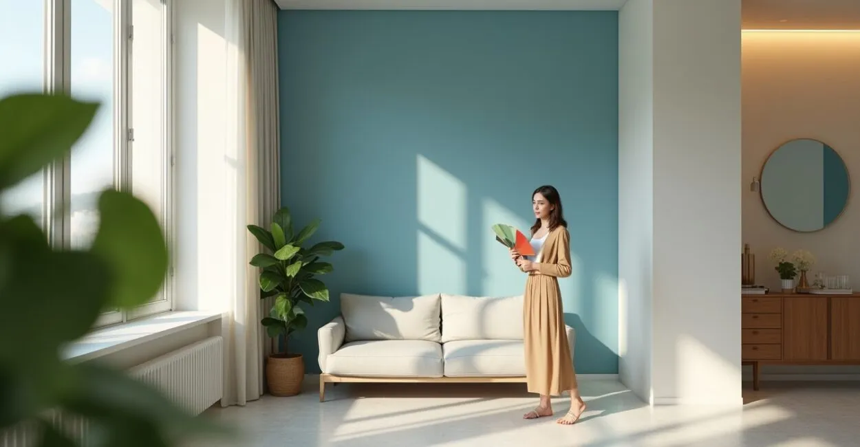
This refers to the strategic selection and application of colors, finishes, and techniques to change how people perceive space and sensory qualities in interiors by working with light, texture, and proportion. This approach combines materials science with environmental psychology to make spaces appear larger.
Interior painting has become essential in residential and commercial projects because it addresses physical and budget constraints. It calls for informed decisions about pigments, reflectivity, and coordination with natural or artificial lighting.

Key Takeaways
- Color, sheen, and contrast form the technical trio that influences the perception of spaciousness.
- Paint selection and surface preparation determine durability and optical performance.
- Integrated lighting and texture can reshape a space without structural changes.
- Choosing the wrong color or finish can lead to costly rework and undermine the intended visual effect.
Interior Painting: Optical Principles and Perception
It starts with understanding how color and light interact to create a sense of space. The physics of diffuse and specular reflection directly affects the perception of depth, while color psychology shapes visual and emotional comfort. We explore how tonal values and reflectance levels change perception, as well as which parameters to measure when predicting results.
The Relationship Between Color, Light, and Depth
Color acts as a light receiver: lighter surfaces reflect more light, making a room appear larger by reducing shadows. Understanding the spectral interaction between natural light and pigments helps prevent unwanted color shifts and maintain consistency from room to room. Diffuse reflection scatters light energy, softening edges and extending visual planes, while specular reflection adds sheen and highlights texture. Adjusting sheen and hue controls how the eye perceives boundaries and spatial continuity.
This understanding informs the selection of colors and finishes that maximize the perceived sense of space without sacrificing comfort or functional contrast, turning theory into measurable, repeatable design decisions.
Reflectance and Finish Selection
Surface Reflectance (SR) quantifies how much incident light a surface reflects. Higher values can make a room feel more spacious, but may also cause glare. Balancing SR and finish is essential for lasting visual and tactile performance. Matte finishes diffuse light and minimize visible marks, supporting visual continuity; satin finishes are easier to clean and help define architectural lines. The choice should account for how the space is used, maintenance needs, and interaction with artificial lighting.
Technical selection also considers chemical and mechanical resistance, ensuring the aesthetic strategy does not compromise the service life or physical integrity of surfaces in high-traffic areas.
Human Perception and Visual Ergonomics
Spatial perception is shaped by visual cues such as contrast, texture, and perspective. Visual ergonomics adjusts these variables to reduce eye strain and increase comfort. Proportions and vanishing lines influence how the human brain reads a space. Changes in hue can affect thermal and psychological impressions, with cool tones making a room feel larger and warm tones making it feel more intimate. Considering the intended users and the room’s purpose helps guide decisions that balance aesthetics with tactile functionality.
Combining reflective panels, directional contrasts, and planned color accents improves spatial orientation, creating rooms that communicate scale, purpose, and well-being without structural work.
Material Selection and Technical Formulation
The choice of paints, pigments, and additives determines the effectiveness and longevity of a color intervention. We compare inorganic and organic pigments, binders, fillers, and additives that affect viscosity, coverage, and UV resistance, as well as how they perform on different substrates.
Pigments, Resins, and Durability
Inorganic pigments offer UV stability and chemical resistance, while organic pigments provide vivid color but may fade with light exposure. Understanding the chemistry is essential for predicting maintenance needs and color changes over time. Resins determine adhesion, flexibility, and abrasion resistance; acrylic formulations are versatile, while polyurethane and epoxy provide durability for technical areas. Compatibilizers improve adhesion to a range of substrates, reducing the risk of delamination.
This analysis leads to precise specifications for coating systems based on the type of space, its use, and maintenance requirements, optimizing life-cycle costs and preserving the original design intent for longer.
Substrate Preparation and Primers
Surface preparation is critical: cleaning, repairs, and compatible primers ensure adhesion and consistent color. Mistakes at this stage are a primary cause of aesthetic and structural failures, making clear work protocols essential. Primers even out absorption and seal porous surfaces, enabling uniform coverage; sealers control efflorescence and stains. Choosing a primer for masonry, drywall, or woodwork reduces rework and protects the final result.
Standardized sanding and curing processes help subsequent coats achieve their projected coverage, directly affecting material use and color consistency across application batches.
Testing and Mockups as Standard Practice
On-site mockups simulate the real interaction of color, light, and texture, providing empirical data that prevents surprises after application. Controlled tests allow fine adjustments to pigment and finish before full-scale work begins. Color measurements, SR readings, and photographs taken with a standardized white balance document results and provide a technical reference for replication and audits. These records support decisions in the event of disputes or revisions.
Investing in prototyping reduces total project costs and makes the spatial expansion effect more predictable, resulting in a more reliable and measurable intervention for multidisciplinary teams.
| Parameter | Effect on perceived spaciousness | Practical recommendation |
|---|---|---|
| Color | Light colors make a room feel larger | Choose light neutrals for small areas |
| Sheen/SR | Higher sheen increases reflection | Balance sheen to avoid glare |
| Texture | Smooth textures make a room feel larger | Use matte finishes for visual continuity |
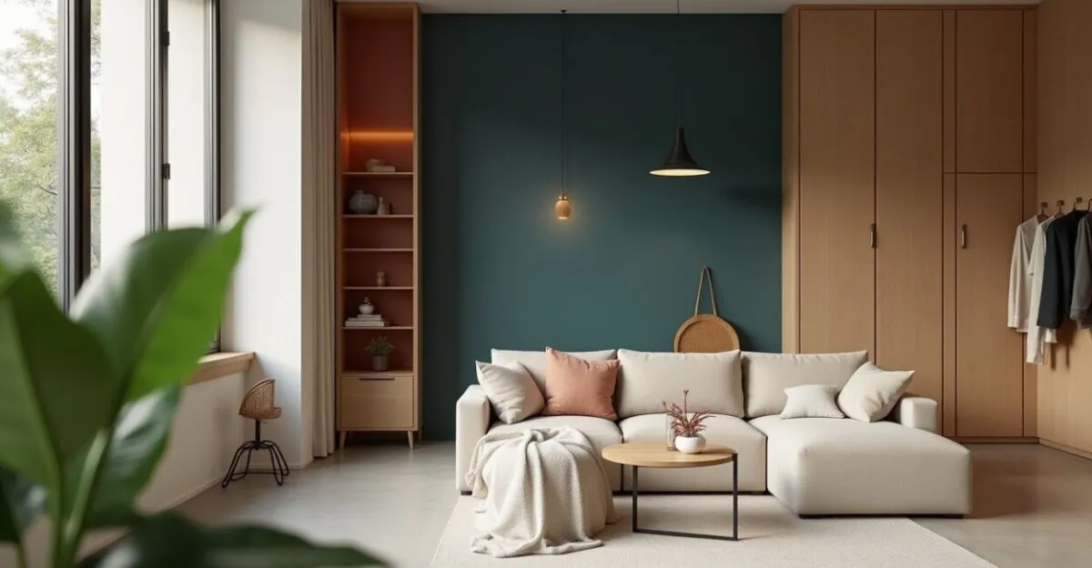
Color Strategies and Spatial Composition

Color can tell a story, direct the eye, and change how a space is read. Here, we explore tonal combinations, targeted contrasts, and color zoning to reshape compact rooms and change how they function and look through deliberate choices.
Palettes and Harmony for a More Spacious Feel
Monochromatic palettes soften transitions and create visual continuity, while subtle accents add depth without breaking up the space. Choosing harmonizing hues preserves a balance between spaciousness and visual interest, avoiding a monotonous feel. Low-intensity contrasts define planes without interrupting visual flow; strong contrasts highlight architectural features and can make a space feel smaller if poorly placed. Choices should account for focal points and circulation.
Modern strategies pair neutrals with muted color accents to create layers of perception that add depth while maintaining functional cohesion and ease of maintenance in residential and commercial settings.
Color Zoning and Visual Flow
Using tonal variations to create zones defines distinct areas without physical barriers, guiding movement and the perception of spatial sequence. This technique works well in open floor plans, where color establishes function and visual direction. Gradual changes in value and saturation draw the eye to focal points, make hallways feel wider, and unify adjoining rooms. Carrying color across the ceiling and baseboards enhances the sense of horizontal expansion.
Planning color transitions around lighting and furnishings prevents visual breaks, creating a flow that improves usability and sensory experience in small spaces.
Functional Contrast and Spatial Clarity
Contrast between surfaces should make doors, steps, and functional features easy to see, preserving safety without sacrificing a sense of spaciousness. Well-calibrated contrast improves wayfinding and reduces the risk of accidents. Applying contrast to vertical rather than horizontal planes changes the perception of height and depth; long horizontal lines make a space feel wider, while vertical lines make it feel taller. Balancing these directions is essential to achieving the desired effect.
The benefits include better circulation, greater subjective comfort, and fewer architectural changes, achieved through low-cost color interventions with a high perceived return.
- What to avoid: choosing overly saturated colors for small spaces.
- Avoid strong contrasts near direct light sources.
- Don’t overlook substrate preparation and the right primer.
Common mistakes undermine the sense of spaciousness and add costs. Avoiding highly saturated colors and addressing the substrate helps prevent aesthetic and functional problems, ensuring a better return on the investment in color.
Application Techniques and Professional Execution
Execution brings a color strategy to life. Application techniques, environmental conditions, and crew expertise affect adhesion, uniformity, and the final result. We cover rolling, spraying, and touch-up methods to ensure a finish that matches the design intent.
Rollers, Sprayers, and Applying Multiple Coats
Application methods affect texture and coverage. Rollers provide an even finish over large areas, sprayers allow for quick, fine coverage, and brushes are essential for corners and trim. Choosing the right technique reduces rework and saves time. The sequence of coats and curing intervals are critical for uniformity and durability; applying thin, controlled coats prevents drips and marks. Controlling temperature and humidity ensures good adhesion and efficient drying.
Standardizing tools and training crews brings professionalism to the process, delivering a predictable finish that matches the approved palette. It also makes future maintenance easier by following industry-standard painting practices.
Read also: IoT: The Internet of Things in Education: Interactive, Connected Learning Environments
Quality Control and Inspection
Visual inspections, thickness measurements, and adhesion assessments document technical compliance. Objective criteria reduce subjectivity and allow deviations to be corrected early. Quality assurance protects the investment and supports technical accountability.
Technical checklists should include SR readings, color uniformity, and the absence of defects such as grit. Photographic records with a scale and field notes provide a basis for quality assurance.
Ongoing feedback between the designer and applicator is essential for fine-tuning, ensuring that the design intent and execution come together to maximize the sense of spaciousness and functionality.
Maintenance and Life Cycle
A maintenance plan preserves the spacious feel over time. Regular cleaning, touch-ups in worn areas, and monitoring for fading prevent a decline in optical performance. Preventive strategies cost less than repainting entire surfaces.
Choosing paints with UV resistance and good coverage reduces the frequency of work in exposed areas. Technical specifications should account for the expected life cycle and how easily future touch-ups can be matched.
Documenting the coating systems used and paint batch numbers makes it possible to match touch-ups precisely, maintaining color continuity and minimizing extensive adjustments during maintenance.
Integration with Lighting and Architectural Features
The synergy between paint and lighting changes how a space feels. Coordinating color temperature, light direction, and intensity with color choices maximizes the visual sense of spaciousness. We look at how frontal, side, and accent lighting interact with finishes and texture.
Color Temperature and Color Balance
Warm color temperatures create a cozy, intimate feel, while cool temperatures make a space feel larger. Balancing the light source with the pigment prevents unwanted color shifts and preserves the design intent under different conditions.
Fine adjustments to light intensity can change how a space feels without altering its materials. Dimmers and diffusers help fine-tune the sensory experience for different times of day and activities.
Designing the lighting alongside the palette ensures the spaciousness effect remains consistent, reducing the risk of colors looking different during the day or under bright evening lighting.
Highlighting Architecture with Controlled Contrast
Highlights on trim, soffits, and architectural frames guide how a space is read, creating layers of depth. Moderate contrast emphasizes volume without breaking up the main visual field, enhancing the sense of continuity.
Linear lighting along baseboards or soffits makes spaces feel wider and taller by creating continuous lines of perspective. The relationship between color and light directs the eye and helps with spatial orientation.
Combined with subtle textures, this approach redefines perceived boundaries, creating a more fluid and functional space without costly structural changes.
Integration with Furniture and Materials
Furniture and finishes influence how color is perceived. Reflective or light-absorbing surfaces change perceived sheen and can tone down or intensify a color strategy. Coordination reduces visual clutter and preserves the intended sense of spaciousness.
Selecting pieces with controlled contrast helps define functional areas without breaking spatial continuity. Avoiding bulky furniture near focal points preserves circulation and an open feel.
Coordinating textures and colors across fixed features and movable furnishings creates cohesive layers that make a space feel larger and improve usability, maximizing the project’s aesthetic and functional value.
| Element | Interaction with light | Effect on the design |
|---|---|---|
| Light-colored ceiling | Reflects overhead light | Makes the room feel taller |
| Side walls | Control depth | Guide visual flow |
| Baseboards and trim | Create lines of perspective | Enhance continuity |
Common Mistakes and Risk Mitigation
Knowing and avoiding common mistakes protects results and reduces costs. Typical problems include choosing colors without testing them, inadequate preparation, and incompatibility between paints and substrates. All can be mitigated through verification processes and clear technical specifications.
Choosing the Wrong Color
Colors chosen without a mockup can cause problems when seen under real lighting; differences between a sample and the finished application can lead to costly rework. On-site testing prevents misjudgments and ensures the result meets the user’s expectations.
Corrections may involve adjusting saturation and value in subsequent coats, but corrective work adds cost and time. The best practice is to validate colors in advance using instruments and larger test areas.
Planning colors with experienced professionals reduces risk and ensures that the chosen shades contribute to a spacious feel while working with the existing lighting and materials.
Inadequate Substrate Preparation
Poorly prepared surfaces can lead to adhesion failures, stains, and discoloration, compromising optical performance and durability. Surface touch-ups cannot replace corrective work when the substrate is contaminated or damp.
Checking for moisture, cleaning, and leveling are critical steps. Skipping them leads to premature repainting and faster cosmetic wear. Investing in preparation reduces total life-cycle costs.
Hiring qualified contractors and following documented technical specifications helps prevent failures. These steps protect the intended spaciousness effect and save resources in the long term.
Chemical Compatibility Between Products
Incompatible products can cause cracking, peeling, and changes in sheen. Understanding coating systems—for example, using acrylic over acrylic and avoiding solvents on water-based coatings—helps prevent chemical failures. Compatibility is a fundamental technical requirement.
Adhesion and resistance tests confirm that the selected system can withstand expected conditions, minimizing defects that could compromise appearance and functionality.
Documenting batch numbers and technical data sheets makes it easier to trace products and take corrective action when needed, protecting the design outcome and the professional reputation of the team.
- Common mistake: testing isolated samples without considering real lighting conditions.
- Common mistake: using finishes unsuited to traffic and cleaning requirements.
- Common mistake: ignoring temperature and humidity during application.
Mitigating these risks requires clear technical protocols, on-site verification, and communication between the designer and applicator, ensuring that the color strategy and its execution stay aligned throughout the process.
Practical Implementation: From Design to Completion
Turning a strategy into finished work involves scheduling, material logistics, and coordination across disciplines. Detailed planning of each phase ensures quality, coordination with suppliers, and predictable aesthetic and technical performance over time.
Scheduling and Sequencing the Work
Sequencing tasks correctly reduces conflicts between trades. Coordinating preparation, painting, and installations allows for proper curing and prevents damage from subsequent work. A schedule also helps keep costs under control.
Allowances for weather and drying time should be built into the schedule, especially in humid climates. Adjusting deadlines to actual conditions prevents rushed work and loss of quality. Clear communication with crews and suppliers is essential.
Planning deliveries in batches reduces waste and makes sampling inspections easier, supporting efficient logistics and contractual certainty while ensuring the work meets technical specifications.
Technical Documentation and Warranty
Written specifications, technical data sheets, and photographic records help verify compliance and support warranty claims. Well-written contracts define responsibilities and acceptance criteria for completed work.
Warranties based on the systems used and maintenance conditions reduce disputes and protect the client. It is important to include objective acceptance criteria so the final inspection can be impartial.
Maintenance manuals explain cleaning and touch-up procedures to preserve the spacious feel, protect the investment, and extend the life of the aesthetic and functional results.
Training and Handover to the End User
Training end users in care and maintenance extends the coating’s performance and preserves the sense of spaciousness. Practical guidance helps prevent practices that wear down protective layers or alter color.
Clear instructions on compatible cleaning products and inspection schedules help preserve the original appearance and reduce the need for corrective work. Educating the user adds value to the project.
A complete technical handover, with guidance and records, turns the color application into a functional, sustainable solution and helps maintain its perceptual impact over time.
Move Forward with Confidence
A technical approach, testing, and professional coordination ensure that interior painting fulfills its purpose of making spaces feel larger and more harmonious, delivering measurable aesthetic and functional value. A technical process reduces uncertainty and protects the investment.
Prioritize prototypes, documentation, and careful material selection, along with coordination with lighting and furniture, to maximize the effect. Well-managed implementation turns a color strategy into a room that feels more spacious and comfortable.
Following these recommendations helps professionals deliver predictable, lasting results, raising quality standards and client satisfaction. An integrated approach turns technical knowledge into spaces that enhance both experience and efficiency.
Start with samples, validate them with measurements, and document every technical decision. This way, each interior painting project becomes a repeatable reference, reducing risks and improving aesthetic and financial returns over time.
Frequently Asked Questions
What Role Does Reflectance Play in Making a Space Feel Larger?
Reflectance measures how much incident light a surface returns to the room. Higher values increase perceived brightness, reduce shadows, and make the space look larger. Choosing an appropriate SR balances brightness and comfort, avoiding glare or a flattened appearance.
How Can You Avoid Differences Between Samples and the Final Application?
Creating on-site mockups under the room’s actual lighting, measuring color with a spectrophotometer, and documenting application conditions minimizes discrepancies. Adjusting pigment and selecting the right primer can address differences in substrate absorption before full-scale application.
Which Finishes Work Best in Small Spaces?
Matte finishes diffuse light and maintain visual continuity, while satin finishes can be used sparingly to highlight architectural features. Avoiding excessive gloss prevents localized reflections that break up the perception of space.
Which Technical Tests Are Essential Before Large-Scale Application?
Essential tests include SR readings, adhesion tests, substrate moisture testing, and color mockups. These tests identify compatibility issues and show how the finish will behave under real lighting, reducing the risk of rework and improving technical predictability.
How Can You Coordinate Paint and Lighting to Maximize the Effect?
It is essential to coordinate the chosen palette with color temperature, light intensity, and direction. Balancing diffuse and focused light preserves functional contrast and enhances the perception of space. Simulations and on-site adjustments validate the interaction between color and light.
Artigos Relacionados
 Neutral Color Palette: Combinations That Make Small Rooms Feel Larger
 Light Colors That Make Spaces Feel Larger
 How to Choose Neutral Colors to Make Spaces Look Bigger
 Why Pastel Colors Are Taking Over Zen Decor Again
 A 20-Minute Morning Routine for College Productivity
 Academic Anxiety: Signs You Ignore Every Day