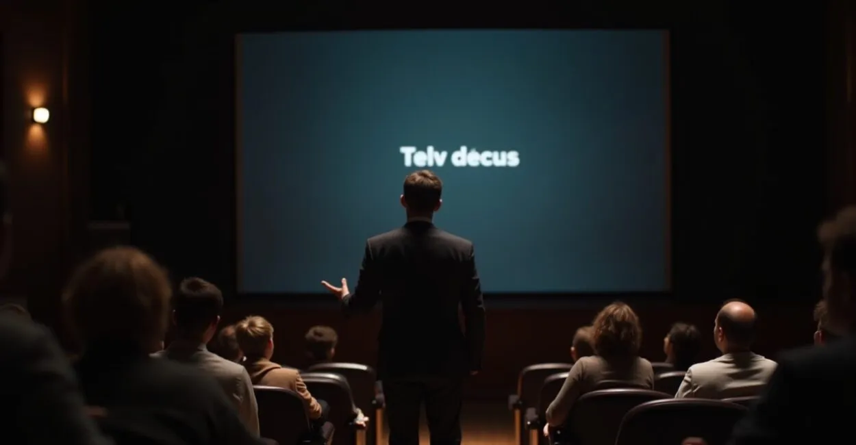
I’ll start in the middle of the room: the lights are dim, a slide shows just one short sentence, and the audience can’t look away. That’s the result of an effective talk outline and structure. If you’ve ever lost your audience by cramming too much text onto slides or getting laughs that went nowhere, this proven template shows you how to spend each minute: an attention-grabbing opening, development supported by social proof, a clear CTA, and a powerful closing.
The Technical Definition You Need—and Why It Matters
An effective talk outline and structure is a logical sequence of sections (opening, development, social proof, CTA, and closing) aligned with the audience’s desired behavior. Technically, it’s a message architecture and attention management system (attention architecture) that combines cognitive design with persuasive storytelling. In plain English: it’s planning what to say, when to provide evidence, and when to ask for action so the audience leaves changed from the way they arrived.

People who work in communication call this “pacing” and “micro-retention.”
How to Allocate Your Time: A Minute-by-Minute Blueprint
A 30-minute talk can follow a 5+20+3+2 breakdown (5 minutes for the opening, 20 for development, 3 for social proof, and 2 for the closing/CTA). For longer events (45–60 minutes), expand the development into three acts: problem, solution, and practical application. Use discreet timers and set checkpoints to recapture attention every 7–10 minutes—when people tend to lose focus. Adjust for your audience: executives want fewer stories, while students want practical examples.

The Hook That Grabs Attention in 60 Seconds (and Real Examples)

Openings with sensory imagery or a small conflict are more convincing than dry statistics. Here’s a practical example: during a talk about innovation, I started by describing the sound of a machine that had just burned out a prototype—and the room went silent. What happens is that a well-crafted scene reduces the psychological distance between the speaker and the audience. A quick story: I told them about a project that failed because no one listened. Afterward, two attendees told me it had changed their approach.
Social Proof That Works—and Weak Proof to Avoid
Short testimonials, verifiable data, and before-and-after case studies are more effective than empty praise. Consider this surprising comparison: saying “more than 1,000 satisfied customers” versus showing a chart of before-and-after success metrics—the chart wins. Common mistakes: (1) using generic testimonials without context; (2) inflating numbers without citing a source; (3) relying only on your own authority. Use quotes that include a name, title, and measurable result.
Read also: A Detailed Budget for Planning Talks Without a Hitch
An Effective Talk Outline and Structure: Language, Pacing, and Visual Aids
Visuals should amplify your words, not repeat them; your pacing should alternate short sentences for impact with longer ones for explanation. Avoid overcrowded slides. Practice verbal transitions that signal what’s next: “now you’ll see” and “what this means is.” Use images with sensory metaphors (for example, a photo that illustrates wasted time). I’ve seen presentations turn indifference into action when they replaced bullet points with photos and stories.
CTAs That Convert: Formats and Placement
A CTA isn’t just asking for something; it’s offering a clear, low-friction next step (for example, “pick up the summary on your way out” or “take out your phone and sign up now”). Place the CTA near the end and repeat it in different ways: visually, verbally, and in your handout. In workshops, A/B tests show that CTAs with an immediate benefit get 2–3x higher response rates. Be realistic: not every CTA works for every audience—context and culture matter.
Read also: How to Promote Talks and Attract the Right Audience
A Checklist of Common Mistakes and a Ready-to-Use Mini Outline
Mistakes that undercut your impact: speaking without a purpose, failing to rehearse transitions, slides that compete with you, and a confusing CTA. Mini outline (10–12 minutes): 1) Sensory opening (1 min), 2) Compelling problem (2 min), 3) Solution with an example (4 min), 4) Short social proof (2 min), 5) CTA and closing (1–2 min). Quick list of what to avoid: excessive jargon, too much data without a story, and failing to signal the next step.
Sources supporting these practices include communication research from Banco Central do Brasil (Brazil’s central bank) on clarity in public presentations and learning studies from Harvard Online on retaining information in lectures.
This method works well for informational talks and pitches, but may not work when the goal is purely free-form entertainment or artistic performance—the context and goal determine the outline. Try it, measure the results, and adjust the time spent on each section until you get the audience response you want.
The next time you step onstage, start in the middle of the story. Ask yourself: What reaction do I want right now? Plan every minute around that answer.
Frequently Asked Questions
How Much Time Should I Spend Preparing My Talk Outline?
It depends on the complexity of the topic and how familiar you are with it. For a 30-minute talk on a subject you know well, plan on 4–6 hours to develop the outline and 2–3 full run-throughs. For a new topic, set aside 10–15 hours for research, outlining, and at least 5 rehearsals. In practice, thorough preparation means testing the opening and CTA with someone outside your team and timing your transitions. Rehearsing out loud reveals where the story breaks down or where you need more social proof.
How Can I Tell Whether My Structure Was Effective After the Presentation?
Combine immediate metrics (questions during the session, handout downloads, and post-talk sign-ups) with qualitative feedback (specific comments about clarity and usefulness). Send a short survey with 3 questions within the first 24 hours: 1) What was your most useful insight? 2) What was missing? 3) What action do you plan to take? Compare the responses with your original goal. Measuring results in the short and medium term shows whether the audience changed its behavior.
Should I Use Text on Slides or Just Images and Spoken Content?
Slides with too much text distract the audience; use images, key phrases, and visual data to reinforce what you’re saying. A good rule of thumb is the “6-second rule”: each slide should be easy to take in within 6 seconds while you speak. For complex data, show a simplified visual and include a reference in the handout. In technical training, detailed tables in an appendix can help those who want to dig deeper without slowing down the presentation.
How Do I Adapt My Outline for Different Audiences (Executives vs. Students)?
The main difference is a focus on outcomes versus a focus on application. Executives want impact and quick decisions: shorten the opening, focus on KPIs, and use an action-oriented CTA. Students want to learn and see practical examples: add short case studies and quick exercises. In both cases, keep the same structure (opening, development, social proof, CTA, and closing) and adjust your pacing and language. Test a short version of your outline with audience representatives before the event.
What Are Clear Signs That I Need to Revise My Talk Outline?
Practical signs include the audience losing focus after 7–10 minutes, a low CTA response rate, repeated questions about the same points, or complete silence after a call to action. Another clue is stumbling over certain transitions during rehearsal. When this happens, revise the opening, cut dense information, add stronger social proof, or rework the CTA. Small timing changes often make a big difference in audience retention.
Artigos Relacionados
 Certificate Templates for Talks: 12 Professional Designs, Design Tips, and Free Tools to Download Now
 The Essential Logistics Checklist for Organizing Talks
 Organizing Talks for Events
 Hub Goiás Event Calendar: Join Exclusive Workshops, Talks, and Meetups to Build Your Skills and Expand Your Network
 Corporate Governance: A Complete Guide to Effective Compliance
 Corporate Event Badge Templates: 12 Layout, Color, and Font Ideas to Improve Identification and Networking