
These are predesigned layouts that organize essential information—name, title, company, access level, and visual elements—to make identification, access control, and interaction easier. Essentially, they’re visual communication tools that translate security rules and networking goals into a format that any person or system can read in seconds.
When designed well, these templates reduce check-in lines, improve venue security, and lead to better professional connections. With events going hybrid and attendee numbers growing, badge design has moved beyond aesthetics to become a critical operational component, integrating printing, RFID/NFC, and digital workflows.

Key Takeaways
- A good badge template has a clear visual hierarchy: readable name, role (title/function), company, and access level—in that order.
- Color palettes and fonts should make badges easy to read from a distance and distinguish categories without relying on text alone.
- Optimized badges reduce average check-in time, improve security, and increase networking rates as measured by recorded interactions.
- Choosing between thermal or digital printing and systems with RFID depends on volume, budget, and access control requirements.
Why Information Hierarchy Determines the Success of Corporate Event Badge Templates
Information hierarchy determines what the eye sees first on a badge. At corporate events, quick recognition is essential: anyone looking at the badge should be able to identify the wearer within two seconds.
That means the layout needs to prioritize what matters for identification and interaction.
Critical Elements and Their Order
The attendee’s name should take up 40–50% of the badge’s visible area, with strong contrast against the background. Below or beside it, the title or role signals relevance for networking. The company name comes third, usually in a smaller font. Access level (speaker, staff, exhibitor, attendee) should be indicated by color or a secondary badge.
Why Order and Contrast Matter
Visual ergonomics research shows that contrast and size affect recognition time. In noisy or artificially lit environments, a large name with high contrast reduces identification errors. Plastic sleeves and anti-glare protectors can also affect readability, so choose sans-serif fonts and medium weights to keep text clear.
12 Practical Templates: Tested Layouts for Different Goals
Here are 12 badge templates designed for common categories: staff, speaker, exhibitor, attendee, VIP, press, sponsor, vendor, partner, volunteer, temporary credential, and digital credential. Each template focuses on an operational goal and requirements for readability, security, and technology integration.
Templates for Quick Identification (Designs 1–4)
Template 1—Large name + secondary title: ideal for speakers and moderators. Template 2—Name + photo + QR code: recommended when identity verification is needed. Template 3—Colored top band for access level: used at events with separate areas. Template 4—Vertical layout with a side logo: optimized for turnstiles and RFID readers.
Templates for Access Control and Networking (Designs 5–8)
Template 5—Badge with embedded NFC: speeds up entry to restricted sessions. Template 6—QR code + short URL to a profile: makes digital connections easier. Template 7—Color-coded identity + industry icon: improves industry-based matching. Template 8—Layout with microtype for backstage authorization levels.
Color Palettes and Fonts That Make Identification and Reading Easier

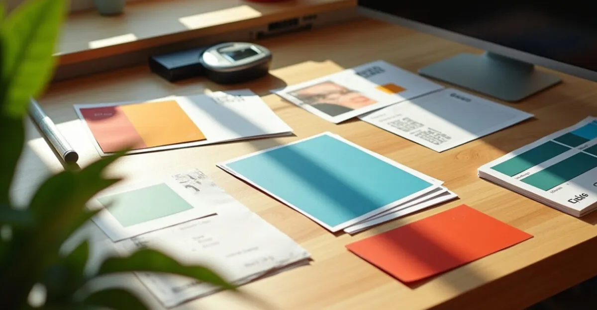
Choosing colors and fonts isn’t just about aesthetics: it directly affects reading speed and the ability to tell categories apart. High-contrast palettes that use bright colors sparingly for essential categories work best. Sans-serif fonts improve readability from a distance and in low-contrast conditions.
Palette Recommendations
Start with a neutral base palette (white, light gray) and use up to three accent colors: one for access level, one for sponsors, and one for urgent or security-related information. Avoid gradients behind text. For large print runs, choose colors that reproduce well in CMYK to prevent differences between batches.
Choosing Fonts and Sizes
Primary font: sans-serif (e.g., Inter, Helvetica, Roboto), at a minimum size of 24–28 pt for names; use a secondary font size of 14–18 pt for titles. A minimum text-to-background contrast ratio of 4.5:1 follows accessibility best practices and reduces reading errors caused by distance or poor lighting.
Technology Integration: RFID, QR Codes, and Digital Credentials in Corporate Event Badge Templates
Technology integration turns a badge into an operational tool. Choosing between RFID, QR codes, and NFC depends on cost, scanning speed, and tracking needs. Each technology places constraints on the physical layout and the material used.
When to Use RFID/NFC
RFID and NFC are recommended for events that need real-time traffic control, such as conferences with simultaneous sessions. They allow quick turnstile access and contactless attendance tracking. The chip insert requires space and can limit design options, so plan its placement in the layout.
Strategic Use of QR Codes
QR codes are inexpensive and easy to implement. They can link to profiles, certificates, or post-event forms. For best results, reserve a clear area measuring 25–30 mm on each side and test readability after printing. Pair the QR code with a brief instruction: “Scan to connect” can increase use.
Production, Materials, and Costs: How to Choose a Printing Method and Substrate
Material affects durability, cost, and brand perception. Basic coated paper works for low-cost events; PVC and PET are more durable and can accommodate chips. Direct thermal printing is fast for credentials produced on-site; digital or offset printing offers color quality for large volumes.
Practical Comparison (Table)
| Material | Durability | Cost per unit (BRL) |
|---|---|---|
| 300 gsm coated paper | Medium (1 day) | R$0,80–1,50 |
| 760 µ PVC | High (reusable) | R$3,50–6,00 |
| Recycled PET | High (durable) | R$2,50–4,50 |
Hidden Costs and Logistics
Factor in lamination, clips or pins, last-minute printing, shipping, and storage. Events with 5,000+ attendees can benefit from outsourced production and color testing; for 100–500 people, on-demand printing reduces the risk of having extras and changes the per-unit price.
Common Badge Design Mistakes and How to Avoid Them
Layout mistakes can create operational problems: names that are too small, poor contrast, unreadable QR codes, chip placement that blocks scanning, and categories that are hard to distinguish. Avoiding these issues requires hands-on testing and minimum readability standards.
Common Mistakes
- Main text smaller than 20 pt
- Using photos without permission or at low resolution
- Low-contrast colors for text and background
- Placing technical components (RFID) without testing
Each issue above affects operations. For example, low-resolution photos make identity verification harder and slow down lines; insufficient contrast leads to reading errors from a distance. Test prototypes under the venue’s ambient lighting and with actual scanners before the final print run.
How to Measure Impact: Relevant KPIs for Corporate Event Badge Templates
Measuring results is essential for justifying design and technology choices. Useful KPIs cover efficiency, security, and engagement. With clear goals, you can compare templates and decide whether RFID, premium materials, or digital integration are worth the investment.
Recommended KPIs
- Average check-in time per attendee (seconds)
- Identification accuracy at restricted entrances (%)
- QR code scan rate per attendee (%)
- Average number of new contacts made per attendee
Set a baseline using past events and measure changes after updating the layout. Tools such as RFID readers and app analytics can generate real-time data. Post-event reports help quantify the ROI of investments in materials and technology.
Next Steps for Implementation
Decide what matters most: security, cost, or the networking experience. Create physical prototypes of at least three selected designs and test them with a representative group of users and operations staff. Use simple metrics—check-in time and QR scan rate—to choose the final design.
Plan a timeline: allow 6–8 weeks for design, approval, production, and logistics for events with more than 1,000 attendees; 2–3 weeks for smaller events. Document technical specifications (sizes, bleed areas, chip placement) to avoid rework and inconsistencies between batches.
Frequently Asked Questions
How Do I Choose Between RFID, NFC, and QR Codes for My Event?
The choice depends on volume, required speed, and budget. RFID/NFC are ideal for high traffic and real-time access control because they allow contactless entry and automated tracking, but they have higher upfront hardware and integration costs. QR codes are inexpensive and easy to implement, requiring only printing and an app or camera; they work well when you only need to link to profiles or content. Also consider the attendee experience and whether badges need to be reusable.
What’s the Recommended Minimum Name Size on a Badge?
I recommend that the name take up 40–50% of the badge’s visible area, with a minimum size of 24–28 pt for sans-serif fonts in standard print. This range ensures readability from an average distance of 1.5–2 meters. For narrow vertical badges, adjust the layout to maintain contrast without condensing the letters. Always test prototypes under the event venue’s lighting to confirm readability and avoid operational problems on the day.
Do Corporate Event Badges Need to Include a Photo?
A photo is necessary when identity checks are strict or attendees need access to restricted areas. For B2B events that require credential verification, adding a photo reduces fraud and makes quick checks easier. For open events, photos add cost and logistical work and generally aren’t worth it. If you include photos, standardize their dimensions, use a neutral background, and set a minimum resolution of 300 dpi to keep them sharp in print.
Which Materials Balance Cost and Durability for Badges?
PVC (760 µ) is highly durable and reusable, making it a good choice for recurring events or loyalty programs; it comes at a moderate cost. Recycled PET is a sustainable option with similar durability and a midrange cost. 300 gsm coated paper is the least expensive and suitable for one-day events, but it has limited durability. When choosing, consider lamination, clip use, and what will happen to the badge afterward to balance cost and environmental impact.
How Do I Structure a Color Palette to Distinguish Categories Without Confusing Attendees?
Use a neutral base palette (white or light gray) and assign a limited number of specific colors to categories (no more than three main colors). Ensure strong contrast between colors and text, and test the palette for color blindness. Use color consistently—on a top band, border, or icon—to make categories easy to recognize. Document Pantone/CMYK codes to avoid variations between print runs, and standardize how colors are used in the event’s brand guidelines.
Artigos Relacionados
 Event Badges: Design, Printing, and Logistics for Professional Identification
 Best Materials for Event Badges: PVC, PET, Bamboo, and Reinforced Paper Compared
 Technology-Enabled Access Control Badges: 8 RFID, NFC, and QR Code Options for Event Security and Speed
 Event Badge Printing: Materials, Equipment, and Finishes for Durability and Professionalism
 Marketing and Selling Event Tickets: Content, Pricing, and Partnerships to Boost Corporate Attendance
 Event and Conference Planning: Timelines, Checklists, and Techniques for Successful Corporate Events