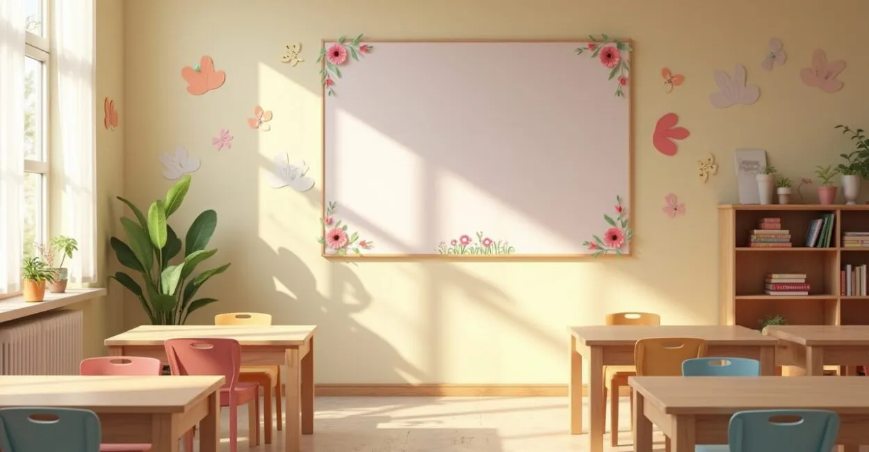
A beautiful bulletin board can transform an entire classroom—and some ideas for Mother’s Day bulletin boards can do just that with very little effort.
In practice, what makes the difference between a forgotten display and one that becomes a photo backdrop isn’t so much “extra effort” as making the right choices: size, visual readability, and room for the children to take part. It may sound like a small detail. It isn’t.

If you’re planning your classroom decorations, the key is to balance warmth with simplicity. The seven ideas below do exactly that, ranging from reliable basics to eye-catching designs that don’t overwhelm the class.
1. The Easiest Design to Get Right
Of all the Mother’s Day bulletin board ideas, the easiest to get right is a centered design with a short message and a few decorations around it. It works because it doesn’t compete with the rest of the classroom. In preschool, that matters: children need to recognize the display from across the room, not hunt for information among too many details.
If the message can be read in three seconds, you’re on the right track. That’s a good rule of thumb. A neutral background, paper flowers, hearts, and a heartfelt message are enough. The trouble starts when the urge to “add just one more decoration” gets in the way of readability.
Anyone who works on classroom decorations knows that fewer embellishments can make a bigger impact. That raises a useful question: how do you keep a simple bulletin board from looking too plain?
2. The Visual Trick That Makes a Simple Design Look Polished
The difference between an ordinary bulletin board and a memorable one often comes down to depth. For Mother’s Day designs, try layering: a solid-color background, shapes cut from craft foam or colored paper, and a standout centerpiece. This adds dimension without requiring expensive supplies.
Here’s one way to think about it: a flat bulletin board looks like a poster; a layered one looks like a backdrop. The effect is immediate. The good news is that you don’t need to master complicated techniques. Just plan what goes closest to the wall, what goes in the middle, and what goes on top.
- Use a solid-color background to “anchor” the design;
- Add medium-sized elements on the sides to frame it;
- Place the main message in the center or near the bottom, where it stands out;
- Use smaller details to fill space without cluttering the design.
This design is perfect when the school wants something attractive that can be put together quickly. And that’s where the more sentimental ideas come in, which involve a different kind of effort.
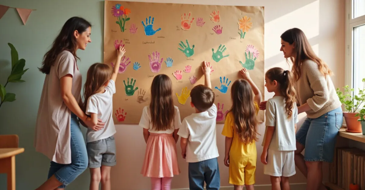
3. A Bulletin Board Featuring Children’s Handprints, Drawings, and Signatures

If there’s one design that truly tugs at the heartstrings, it’s one the whole class helps create. Of all the Mother’s Day bulletin board ideas, this one is often a favorite because it turns a decoration into a keepsake. Painted handprints, family drawings, and children’s names bring it to life. It’s more than a decoration; it’s a record of the moment.
In practice, this kind of display has an effect many people underestimate: it holds parents’ attention longer because they look for their own child in it. It’s almost automatic. I’ve seen simple displays with just a title and handprints get more comments than elaborate designs covered in glitter.
When children take part, the bulletin board stops being a backdrop and becomes a memory.
This design works especially well in preschool, but it takes some planning to keep it from looking cluttered. That brings us to the trickiest question: what should you avoid to keep the final result looking good?
4. The Biggest Mistakes That Can Ruin a Mother’s Day Bulletin Board
The biggest mistake isn’t not having enough supplies. It’s using too many without a plan. When making a Mother’s Day bulletin board, rushing tends to show in two ways: letters that are too small and colors mixed without a clear plan. The result may look good in a close-up photo but lose its impact from across the room.
Avoid these pitfalls:
Read also: How to Make a Mother’s Day Bulletin Board for Preschool
- Messages that are too long for a small bulletin board;
- Too many different fonts in the same space;
- Too much glitter, which makes the message harder to read;
- Elements placed too close together, with no visual breathing room;
- Themes that are too childish for older students or too sophisticated for younger ones.
There’s also one important caveat: this approach works well in bright classrooms with clear wall space, but it falls flat if the room is already visually busy. A design doesn’t need a lot of information to be moving. Sometimes, well-used empty space lets the display breathe.
5. When a Bulletin Board Becomes a Photo Backdrop
Some Mother’s Day bulletin board ideas do more than decorate; they create a photo spot. That’s become much more common in recent years as schools have started thinking about the whole family’s experience, not just the presentation itself. A simple balloon arch, a flower frame, or a string of messages can turn a wall into a place families want to visit.
The key is not to confuse impact with excess. A complete backdrop works best when it has a clear focal point, a visual frame, and open space for families to stand in front of it. If everything competes for attention, nothing stands out.
General visual communication guidance for educational spaces, including materials from INEP, Brazil’s National Institute for Educational Studies and Research, emphasizes that clarity and legibility matter as much as appearance when the goal is to guide and welcome people. That applies even to a festive bulletin board.
Next, think about choosing the right size for each class—because even the best design can fall flat if it’s out of proportion to the space.
6. The Right Bulletin Board for a Small Classroom, Hallway, or Courtyard
The space matters more than inspiration. A Mother’s Day display designed for a hallway can’t use the same layout as one for an open courtyard. In a small classroom, aim for a moderate height and a central focal point; in a larger space, you can spread out the elements and create a design that people read in sections.
One rule of thumb helps: if the wall competes with the display, the display loses. In tight spaces, choose just a few colors and large elements. In larger areas, you can break the design into sections—title, illustration, tribute, and photo area.
Space
Best approach
What to avoid
Small classroom
One focal point and a quick-to-read design
Lots of small cutouts
Hallway
Vertical layout and a short message
Elements that stick out into the walkway
Courtyard
A large design with a photo area
Flimsy construction
This approach echoes a principle of environmental health: less visual clutter, more clarity of use. In school settings, Fiocruz, Brazil’s public health research foundation, often emphasizes the importance of organized spaces for well-being and easy movement. It’s not just about looks; it’s about how people share the space.
7. The 7 Bulletin Board Ideas That Really Work at School
If you want to stop improvising, think of Mother’s Day bulletin board ideas as categories to help you decide. What works for one class may not be right for another. That’s why so many people get stuck choosing: it’s not a lack of ideas; it’s a lack of a way to narrow them down.
- Classic: flowers, a heart, and a short message;
- Sentimental: photos, names, and messages from the children;
- Creative: handprints, frames, and contrasting colors;
- Minimalist: a few pieces and a clean background;
- Interactive: space for messages or drawings;
- Photo backdrop: designed for family pictures;
- Elaborate: layers, cutouts, and detailed finishing touches.
A quick story shows how this works in practice: one preschool class put together a display full of details, then realized there was no room for the children to add their own drawings. The following week, they started over with fewer elements, left an open strip in the middle, and made room for painted handprints. The display looked less “full” and much more alive. The whole class noticed the difference right away.
Data on teaching practices in school settings from Brazil’s Ministry of Education reinforces an idea that makes sense in the classroom: participation matters more than excessive decoration. And that really comes through on Mother’s Day.
The best bulletin board isn’t the loudest; it’s the one that brings out emotion effortlessly.
How to Choose Among Mother’s Day Bulletin Board Ideas
If you’re still unsure, ask yourself three questions: how much time do you have, how many children will take part, and how big is the wall? The answers will almost always point you to the right design. Limited time calls for a simple layout. A class eager to participate calls for an interactive board. A large space calls for a more elaborate backdrop.
The classic mistake is choosing based on how impressive a photo looks instead of what will work at your school. A beautiful Pinterest display can become a headache if it requires hard-to-find supplies, color printing, or hours of assembly. Ideally, the design should fit your class’s routine and be something you can put together without rushing.
If you take the time to narrow down your options, Mother’s Day bulletin board ideas stop being a last-minute problem and become both a teaching tool and a heartfelt gesture. That makes all the difference in the final result.
Frequently Asked Questions About Mother’s Day Bulletin Board Ideas
What’s the Best Mother’s Day Bulletin Board for Preschool?
The best option is usually one that combines a quick-to-read message, large elements, and children’s participation. In preschool, displays with painted handprints, hearts, and short messages work especially well because they’re easy to put together and have an immediate emotional appeal. For a small class, a centered design is enough; if you have more time, add drawings and messages.
How Can I Make a Bulletin Board Look Good Without Spending Much?
Use a solid-color background, colored paper, craft foam, and a few well-placed elements. Instead of trying to fill the wall, focus your effort on one strong focal point: the title, a frame, or a group of large flowers. Keeping the design visually simple often pays off more than cutting back on supplies, because the display looks organized and polished.
What Should Every Mother’s Day Bulletin Board Include?
A clear message, a cohesive color palette, and something that connects the class to the tribute. That could be a drawing, handprint, photo, or something the children have made. Without it, the display may look nice but feel impersonal. The detail that moves people most is almost always something the students actually helped create.
Can I Use the Same Bulletin Board Ideas for Different Classes?
Yes, but it’s worth adjusting the size, amount of information, and level of complexity. An older class can handle a fuller design; preschoolers respond better to large, clearly defined shapes. The same design can work for two classes as long as you adjust its proportions to the space and the children’s ages.
How Far in Advance Should I Set Up the Bulletin Board?
It’s best to start a few days ahead, especially if the children will be making things for the display. That helps you avoid rushing, glue that hasn’t dried, and last-minute improvising. When you set it up early, you can test the layout, check that the message is easy to read, and make sure the display looks good in person and in photos.
Artigos Relacionados
 Mother’s Day Cards in Elementary School: Practical Ideas
 Mother’s Day Celebration: A Practical Guide for Educators
 Mother’s Day Activities for Elementary School
 Cut-and-Paste Jobs: A Playful Preschool Activity
 Songs and Poems: Heartfelt Tributes to Mothers
 Mother’s Day in Early Childhood Education: 7 Memorable Activities